But there's a disturbing trend in education (brought in from non-technical fields) and in the reporting of technical fields (done by people with minimal-to-none interest in the technical matters, and yes, that includes those with putative training in the technical fields whose work is now in the infotainment business) of moving away from technical knowledge even in those technical fields:
The answers to the type 2 questions, real technical questions, from the top:
First question: The combustion equation would be
CH$_4$ + 2 O$_2$ $\rightarrow$ CO$_2$ + 2 H$_2$O
but it's unnecessary; since each methane molecule will yield a CO$_2$ molecule we can simply calculate the ratio of the masses: m(CO$_2$)/m(CH$_4$) = (12+2*16)/(12+4) = 44/16 = 2.75, so a metric ton of methane will yield 2.75 metric tons of carbon dioxide.
Second question: The density of air at one standard atmosphere and 19°C is 1.225 kg/m$^3$, so a 25 m$^3$ room contains 30.625 kg of air. A 1000 W heating element releases 3.6 MJ of energy in one hour. The increase in temperature is therefore (3600 kJ)/(30.625 kg x 0.72 kJ/(kg °K)) = 163 °K, for a final temperature of 182°C.
(Assuming no losses to the outside and using a constant value for the isochoric specific heat for air throughout the temperature range 0-200°C to avoid computing an integral, a reasonable approximation given it varies between 0.70 and 0.74 in that range.)
Third question: At resonance frequency $wL = 1/(wC)$ so $w^2 = 1/(LC)$, $w = 57,735$ radian/s or f = 9189 Hz. At that frequency the capacitor and inductor cancel each other out (impedance is zero and power factor is 1), so peak power is $5^2/100 = 250$ mW and RMS power is $250/\sqrt{2}$ = 177 mW.
These are not "gotcha" questions: I learned to solve the second in 11th grade; I learned electronics and chemistry by myself as a kid, but the material to solve the first was taught in 9th grade and the third in 11th grade, for students taking a chemical or electronics track in high-school (9th-12th grades). All of this was assumed known for incoming EECS students in the early 80s in Portugal.
Tempora mutantur, nos et mutamur in illis
From a video of an event in 2016. Most of the weight loss happened in the last 12 months as the result of intermittent fasting and a focus on high-protein, low-energy foods.
Another growth industry in San Francisco
When authors want to be science-y, but don't want to do the science…
From a mil-fic book that we'll keep unnamed.
At 18 km altitude, the gravity is 99.4% of the gravity at sea level ($6378^2/(6378+18)^2$), so Colonel Z would need super-human perception to be able to separate that $0.006 g$ from the turbulence and change in aircraft acceleration due to atmospheric changes.
(The story itself makes little sense, it's a remake semi-update of Tom Clancy's "Red Storm Rising," but with several errors of logic and biased by the need to make Russians super-hyper-badissimo-evil idiots.)
Chocolate milk, the high Protein-to-Energy version
Geeky linkage
(Because work has gotten into the way of blogging, social media, and other things. Book is 90-95% complete.)
Claustrophobia-inducing video by Smarter Every Day crawling inside a torpedo tube in a submarine while it's under the Arctic Ice Cap.
Nasa makes Einstein-Bose condensates aboard the ISS.
Scott Manley showcases the ideal villain lair, complete with a rocket to take the villain to a secret space base. Or a smart way to use the oceans to position a launch pad precisely where one wants (on the Equator, for example, to minimize the energy necessary to change the inclination of the orbit for a GEO satellite).
Because a real geek needs some sci- fi in their life.
From my YouTube subscriptions, the image that inspired all this:
Ah, MIT teaching, where professors get former students who they consult for/with to teach all their classes, while still getting their teaching requirement filled…
(For what it's worth, students probably get better teaching this way, given the average quality of MIT engineering professors' teaching.)
These are not the typical MIT/Stanford/Caltech post-docs or PhD students teaching the classes of their Principal Investigators or Doctoral Advisors. These are business associates of Tom Eagar, who get roped into teaching his class "as an honor." (In other words, for free.)
Note that there is such a thing in academia as "organizing a seminar series," which some professors do (for partial teaching credit), formally different from "teaching a class" (full teaching credit). Doing the former for the credit of the latter… questionable, but sadly common in certain parts of academe.
On the other hand, as most MIT faculty and students will confirm, technical learning is 0.1% lectures, 0.9% reading textbook/notes, 9% working through solved examples, 90% solving problem sets, so all this "who teaches what" is basically a non-issue. (These numbers aren't precise estimates, just an orders-of-magnitude reference used at MIT.)
That's probably the major difference between technical fields and non-technical fields, that all the learning (all the understanding, really) is in the problem-solving. Concepts, principles, and tools only matter inasmuch as they are understood to solve problems.
(Sports analogy: No matter how strong you are, no matter how many books you read and videos you watch about handstand walks, the only way to do handstand walks is to get into a handstand, then "walk" with your hands.)
Which brings us to the next section:
Understanding technical material
There are roughly five levels of understanding technical material, counting 'no knowledge or understanding at all' as a level; the other four are illustrated in the following picture:
The most basic knowledge is that the phenomenon exists, perhaps with some general idea of its application. We'll be using gravity as the example, so the lowest level of understanding is just knowing that things under gravity, well, fall.
This might seem prosaic, but in some technical fields one meets people whose knowledge of the technical material in the field is limited to knowing the words but not their meaning; sometimes these people can bluff their way into significant positions simply by using a barrage of jargon on unsuspecting victims, but generally can be discovered easily by anyone with deeper understanding of the material.
A second rough level of knowlege and understanding is a conceptual or qualitative understanding of a field; this is the type of understanding one gets from reading well-written and correct mass-market non-fiction. In other words, an amateur's level of understanding, which is fine for amateurs.
In the case of gravity this would include things like knowing that the gravity is different on different planets, that there's some relationship with the mass of the planet, and that on a given planet objects of different masses fall at the same rate (with some caveats regarding friction and fluid displacement forces).
The big divide is between this qualitative level of understanding (which in technical fields is for amateurs, though it's also the level some professionals decay to by not keeping up with the field and not keeping their learned skills sharp) and the level at which a person can operationalize the knowledge to solve problems.
Operational understanding means that we can solve problems using the material. For example, we can use the formula $d= 1/2 \, g \, t^2$ to determine that a ball bearing falling freely will drop 4.9 m in the first second. We can also compute the equivalent result for the Moon, using $g_{\mathrm{Moon}} = g/6$, so on the Moon the ball bearing would only fall 82 cm in the first second.
This level of understanding is what technical training (classes, textbooks, problem sets, etc) is for. It's possible to learn by self-study, of course, since that's a component of all learning (textbooks were the original MOOCs), but the only way to have real operational understanding is to solve problems.
There's a level of understanding beyond operational, typically reserved for people who work in research and development, or the people moving the concepts, principles, and tools of the field forward. Since that kind of research and development needs a good understanding of the foundations of (and causality within) the field, I chose to call it deep understanding, but one might also call it causal understanding. Such an understanding of gravity would come from doing research and reading and publishing research papers in Physics, rather than applying physics to solve, say, engineering problems.
An example: Sergei Krikalev, the time-traveling cosmonaut
The difference between qualitative understanding and operational understanding can be clarified with how each level processes the following tweet:
More precise data can be obtained from the linked article and that's what we'll use below.*
Qualitative understanding: Special Relativity says that when people are moving their time passes slower than that of people who are stationary; the 0.02 seconds in the tweet come from the ISS moving around the Earth very fast.
(There's a lot of issues with that explanation; for example: from the viewpoint of Krikalev the Earth was moving while he was stationary, so why is Krikalev, instead of the Earth, in the future? Viascience explains this apparent paradox here.)
Operational understanding: time dilation relative to a reference frame created by being in a moving frame with speed $v$ is given by $\gamma(v) = (1 - (v/c)^2)^{-1/2}$. The ISS moves at approximately 7700 m/s, so that dilation is $\gamma(7700) = 1.00000000032939$. When we apply this dilation to the total time spent by Krikalev at the ISS (803 days, 9 hours, and 39 minutes = 69,413,940 s) we get that an additional 0.0228642576966 seconds passed on Earth during that time.
Because we have operational understanding of time dilation, we could ask how much in the future Krikalev would have traveled at faster speeds (not on the ISS, since its orbit determines its speed). We can see that if Krikalev had moved at twice the ISS speed, he'd have been 0.0914570307864 seconds younger. At ten times the speed, 2.2864181341266 seconds younger. And at 10,000 times the speed – over 25% of the speed of light – almost 28 days younger.
As a curiosity, we can use that $\gamma(7700)$ to compute kinetic energy, $E_k(v) = (\gamma(v)-1) \, mc^2$, or more precisely, since we don't have the mass, the specific energy, $E_k(v)/m = (\gamma(v)-1) \, c^2$. At its speed of 7.7 km/s the ISS and its contents have the specific energy of ethanol (30 MJ/kg) or seven times that of an equivalent mass of TNT.
To say that one understands technical material without being able to solve problems with that same understanding is like saying one knows French without being able to speak, read, write, or understand French speech or text. Sacré Bleu!
The application is what counts.
- - - - -
* The article also refers to the effect of gravity, noting that it's too low to make any difference (Earth gravity at the ISS average altitude of ~400 km is 89% of surface gravity; both are too small for the General Relativity effect of gravity slowing down time to be of any impact on Krikalev, or for that matter anyone on Earth).
Use longer, content-heavier handouts; integrate local and up-to-date content; and show numbers and math.
Change 1: Longer and content-heavier handouts
The only significant complaint from previous cohorts was regarding the lack of a textbook. I post a selection of materials to the course support intranet (consultancy reports, managerial articles, academic papers, book chapters), but a few students always remark on the lack of a unifying text for the class.
(There's no unifying text because -- in my never humble opinion -- most Consumer Behavior textbooks are written from a consumer psychology point of view, while I prefer a more marketing engineering point of view.)
Taking that into consideration, I made longer, denser handouts, each like a book chapter rather than just support for in-class activities. The class is participant-centered, with minimal lecturing, so these longer handouts help students feel that they have a coherent framework to fall back on.
Handouts changed from a median size of four pages of mostly diagrams, in 2012, to a median size of eighteen pages of text, diagrams, and numbers, in 2014. (Just a reminder, since there's some confusion about it, that handouts and slides serve different purposes.)
Change 2: More local content
I used local content in most class sessions: local products, merchandizing from local retailers, and examples from local advertising. In particular, using outdoors from around the campus allowed students to recognize their location, for a little a-ha moment that improves mood.
The main advantage of local content is student familiarity with it. Examples are more effective when students don't have to learn new brands, new product categories, and other regional differences. A disadvantage is additional preparation work, but that work also signals to the students the instructor's commitment to the class.
A secondary advantage of local content is as evidence of instructor competence. Local content, and up-to-date content, requires confidence, ability, and practice. For this reason alone, it's worth the additional work, even if old or foreign examples would be equally good for teaching.
Change 3: More numerical content
The rise of analytics is a highly visible trend in marketing; marketing courses are therefore increasingly quantitative. Still, most Consumer Behavior courses shy away from math.
Our course was different: there were plenty of numbers and models. I did most of the work, not the students, since the objective was not to teach them analytics; but I did do the work, so the students were shown modern marketing techniques rather than a lot of hand-waving.
For example, to illustrate the effects of memory on different types of advertising timing, I used a computer simulation of a learning model: instead of rules-of-thumb for media planning, students saw how learning and forgetting rates change the effectiveness of blitz versus pulsing media timing.
(References to technical materials were provided for students wishing to learn more, of course.)
Results
Despite objectively covering more material than before and using harder assessment measures, student grades were higher. In other words, these changes achieved their primary objective: students learned more material and learned it better.
Class dynamics were better than before, though they were pretty good in previous years. When I pick up my teaching evals in 2016 (they're on paper), I'll know whether I kept my top-5 ranking from 2012.
Addendum: In short events since the MBA class, I replicated these three changes, yielding performance improvements along all dimensions: participant learning (as measured by in-event exercises), participant experience (as measured by client-run event evaluations), follow up contact with the participants, and word-of-mouth.
Participant-centered learning is not scalable, so it's MOOC-resistant.
A couple of colleagues (in different fields) have shared MOOC-related worries with me. The logic goes, our research jobs are funded to a large extent by teaching, and if the need for teachers disappears, many schools will stop hiring expensive research faculty. Cathy "Mathbabe" O'Neil suspects MOOCs will have tragic consequences for mathematics research.
I'm not convinced.
As I see it, there are three main MOOC threats to traditional higher education: cost-effectiveness, brand equity of the schools offering the MOOCs, and quality of content. There's also one main visible weakness, certification.
Cost-effectiveness. The cost-effectiveness of MOOCs is the main argument I hear for "the end of universities as we know them," to which I say: if you can replace class X with videos of lectures and computer-graded problems sets, good riddance to class X.
Distance learning is an old proposition, it started with something called "a book." MOOCs add better media, the possibility of computer graded problem sets (for some fields, and requiring a significant investment in problem set design), and tutoring or discussion affordances.
But here's the crux: the scalable parts of MOOCs are the easy part of education. The hard part is motivating students, interacting with them and being responsive to their questions, taking the time to understand the reason for their incomprehension, and reacting in real time to information they bring into the class or developments in the field.
So, while MOOCs will work really well for highly motivated, studious students (nerds like me), the average student will need more personalized attention than is cost-effective to offer in large scale.
Repeat after me: Personalized attention doesn't scale.
True, many classes in many institutions of higher learning don't deliver anything more than the scalable parts of the MOOCs; no personalized attention or significant interaction with the students at all. Those classes are ripe for replacement by MOOCs, and that's good.
This is what gets me steamed about Mathbabe's post: if the professors don't add value to a student reading the textbook and solving the problem sets (that in many cases are straight off teachers' manuals from the textbook publisher and graded by teaching assistants), then what is the purpose of hiring someone with a deep understanding of the field a/k/a a research faculty member?
The answer to that lies in the value of an instructor with a deep understanding of the field to manage participant-centered learning (now called "flipped classroom" but in fact the only way anyone ever really learned any technical material was by practicing it).
Brand equity. Who wouldn't rather say "I took the Caltech Machine Learning course" rather than "I took the Cal State-Moraga Machine Learning course"? This is indeed a problem, but to a large extent it's a matter of brand credibility footprint, not a technological issue.
With prestigious schools creating extension campuses and joint ventures with other universities, MOOCs are only a small part of the problem. And let's remember that brand extensions are not one-way propositions; MOOC-rizing courses may dilute a school's brand equity. (So may having extension campuses, of course. Armani Exchange doesn't help the brand equity of Armani.)
Talking to some Hahvahd B.S. colleagues, I got the distinct impression that they believe the student physical presence in their Cambridge (Allston, really) campus is an essential part of the brand identity, one that they are not willing to compromise on. I'd venture that at Hahvahd B.S. they know a thing or two about the network and identity dimensions of brand equity.
So, I agree that the brand equity is an issue, but more because of extension campuses and joint ventures than MOOCs, since the brand credibility footprint is much more likely to encompass the former than the latter. (Says the visiting professor at TheLisbonMBA, a joint venture of UCP, UNL, and MIT.)
Quality. Obviously there's a difference between the quality of the classes taught at Caltech and at [the fictional] Cal State-Moraga; and that is part of the brand equity of Caltech. But the real question is whether the students of CS-Moraga are going to benefit from a class that was designed for Caltech students more than from one that was designed specifically for them.
Note that this immediately raises the question of whether CS-Moraga classes are customized to their student population (that is now, before being MOOC-rized). And that's again the issue of what faculty are doing at CS-Moraga: if they rely on the textbook and the teachers' materials provided by the textbook publisher in order to save themselves the trouble of actually preparing a class, then as I said above, good riddance.
On the other hand, in participant-centered learning the instruction follows from the participants' needs and skills, moving at their pace, therefore for good quality the instructor must have a broad training in the general field and a deep understanding of the materials of the class.
It's incumbent upon the faculty to make itself more valuable than a cost-effective MOOC, or a textbook for that matter. Otherwise, it's their own fault if they're MOOC-rized
Certification. Certification of knowledge is the weak point of MOOCs as they currently exist, but it's important to note two issues with this.
First, certification cannot be the only function of universities or research faculty, as certification alone doesn't require the large infrastructure and cost of a university or the need for broad research programs.
Second, and much more critical, if the MOOC certification weakness is part of the advantage of a traditional university, that weakness ends if universities stop taking their certification responsibilities seriously. When some schools graduate computer engineers who never wrote a program that passed a compiler's syntax check, let alone run, let alone run correctly or efficiently — to choose an example I heard from someone I trust — then the credibility of universities as certification mechanisms comes into question, and their advantage vis-a-vis MOOCs in this regard evaporates.
(Yes, there's a third possible issue, that of MOOCs adding some sort of credible certification. I believe that that's a long way off, given how it would require (a) an infrastructure to prevent fraud; (b) some sort of long-term evaluation, since not everything can be certified with a short test; and (c) legal protection in case of unacceptable demographic results in aggregate, which universities seem to have had grandfathered in, but other institutions have found themselves liable to.)
I for one welcome our new MOOC multimedia limited-interaction e-textbooks for the 21st Century. As a complement to real instruction: customized, personal, and responsive. And as a mechanism for making universities take certification seriously.
It was the best of talks, it was the worst of talks.
(Yes, I understand that Dickens's opener has been used to the cliché limit; but the two examples I have in mind really bracket the space of possible talks. At least those talks with voluntary attendance.)
The best of talks: Michael Tilson Thomas at TED.
Even if you don't like art music, this talk is well worth watching for the presentation skills demonstrated by MTT:
MTT opens with a personal story of an interesting coincidence (his father's name was Ted); this is not my preferred type of opener, but he builds a personal narrative out of that opener and then merges it with his main topic very well.
MTT sits at a baby grand piano, which he occasionally plays to illustrate points about music evolution. This interactive production of the presentation material, similar to writing and running code or analyzing data in a technical presentation, has three main presentation advantages that make up for its risks:
1. Visual and physical variety, or more generally, presentation process variety. Every few seconds the image changes, the activity changes, the type of presentation changes: speaking, playing piano, describing a photo, narrating a video, watching a video without narration, listening to recorded music. Compare that with 18 minutes of speaking to slides bearing bullet points.
2. Clear demonstration of expertise, which projecting a video or playing recorded music cannot do. In a live demonstration or performance there's always a risk that something will go wrong, which is why many presenters avoid this kind of demonstration. But the willingness to take that risk is a strong signal to the audience of the presenter's competence and expertise.
3. Adaptability (not really used by MTT, since his was not a talk with audience interaction). This is particularly important in teaching technical material, I think: allowing the students to ask questions and see the answers come from the techniques that we're teaching them is a lot better than just showing them slides. (Of course real learning happens when the students do the work themselves, but this kind of demonstration helps begin the process and motivates them to act.)
The supporting materials were superbly chosen and executed. Credit here is due to a large supporting cast for MTT: this presentation uses materials and skills from the education and multi-media presence of the San Francisco Symphony, an organization whose main business is performing. But here are five important lessons that these materials illustrate:
1. No bullet points, and few words (mostly as subtitles for foreign language). The projected materials (including a large camera shot of MTT when no other materials are using the screen) are there to support what MTT is saying, not to remind MTT of what he wants to say.
2. The production values of the materials are professional (you can assess their quality on the 720p video) and that signals that this presentation is important to MTT, not something put together in the flight down, between checking email and imbibing airline liquor.
3. MTT's presentation never mentions the support, only the content: he doesn't say "this slide shows a photo of my father," he tells the story of discussing music with his father as the photo appears on screen. The photo is a support for the narrative instead of the narrative taking a detour to acknowledge the technology and the specifics of the material that is supporting it.
4. The interaction between materials, speech, and piano playing was choreographed in advance, with the video producer knowing which shots to use at each time. This comes from the extensive documentary and educational work of the San Francisco Symphony under MTT, but to some extent can be replicated by presenters of more technical material if they take the time to think of their presentation as a series of "cuts" in a video production.
5. It's not on the video, but it's obvious from the fluidity of the speaking, piano playing, and video materials that this talk was carefully planned and thoroughly rehearsed. That's not surprising: after all, a dress rehearsal is nothing new to a performing artist, and MTT clearly saw this talk as a performance. Most presenters would benefit from seeing their talks as performances (once they get the content part well taken care of, obviously).
The speech was well structured, with a strong opener and closer, repetition of the key points with different phrasing at the bridge points, and with the right mix of entertainment and education that is expected of a TED talk.
MTT had a teleprompter at his feet and notes on top of the piano, which in the video appear to include a couple of lines of music score, possibly as a reminder of the harmonic evolution he demonstrates at timecode 5:28 to 6:02. Many presenters are afraid that using speaker notes makes them look unprepared or "just reading their speech." This is an erroneous attitude for five reasons:
1. Expertise can be demonstrated in different ways, like MTT playing the piano. And as a general rule, the audience will have some idea of the expertise of the presenter, established ahead of time by other means.
2. Open discussion or question and answer periods allow the speaker to wow the audience with his or her ability to extemporize. (As a general rule, I suggest speakers prepare notes on some of the more likely questions that may need some thinking ahead, but not read them verbatim.)
3. Reading a speech is a difficult skill; most people can't do it correctly. Even when I write a speech for myself, I find that I also make notations on it and end up using it more as a psychological crutch than an actual speech to read. It's fairly obvious that MTT is not reading the speech verbatim.
4. Even if MTT is partially reading a prepared speech, it's most likely one that he had a big input in writing. Other than celebrities, politicians, and CEOs, most presenters will have written their speeches, and most audiences will expect that they did.
5. Ironically, many people who look down on unobtrusive speaker notes or teleprompters put their speaker notes on the screen as bullet points, confusing the materials that are there to help the speaker (notes) with the materials that are there to help the audience process the presentation (visual support).
The material MTT covers meshes with music history so he uses stories and storytelling as the main text form. Stories are one of the six tools for memorability the Heath brothers recommend in the book Made To Stick, and they work very well here. MTT also uses what Edward Tufte calls the P-G-P approach to exposition, presenting a Particular case first, then making a General point, then capstoning that point with another Particular example.
Dancing and singing aren't common techniques in presentations, but MTT uses them to great effect at timecode 2:24. In other presentations some acting or character impressions can be used for the same purpose: break the solemnity of the occasion, signal that you take the subject seriously but you don't take yourself too seriously, or to bridge topics.
(On a video that's no longer available online, John Cleese of Monty Python keeps interrupting his own presentation on creativity techniques with "How many X does it take to change a light bulb" jokes, as a way to give the audience breaks. And those jokes are part of a running arc that he established at the beginning of "there's no real training for creativity so I might as well spend my time telling jokes.")
Personally I don't recommend singing, dancing, or telling jokes in a talk unless you are a professional singer, dancer, or comedian, and even so only sparingly. Note that MTT did it for a very specific and memorable point: that a "piece of 18th Century Austrian aristocratic entertainment" turned into the "victory crow of [a] New York kid," and that's the atemporal power of music.
And as a closer, MTT rehashes the opening theme "what and how" and adds a cornerstone "why," ending on a good note and high energy. It's always important to have a strong closer, almost as important as a good opener.
Two minor observations:
1. MTT should have had a sip of water right before the talk and sloshed it around his mouth and lips, to avoid that smacking sound when he speaks. That sound is created by dryish areas in the mouth letting go at inappropriate times; sloshing the water solves it, drinking doesn't.
2. I assume that MTT's fleece was chosen to match his clothes and accessories, but he could have one custom-made in that color with the logo of the San Francisco Symphony. Maybe this is my crass commercialism rearing its ugly head, but with not flaunt the brand?
The worst of talks: a presenter who will remain anonymous at an undisclosed conference.
For clarity of exposition I'll call the presenter EF, for "Epic Fail," and use the pronoun "he" without loss of generality over gender.
EF started his presentation with a classic: computer trouble.
EF's talk was the last in a four-talk session; the other three presenters had installed their presentations in the podium computer during the break before the session, but EF did not. An alternative to using the podium computer would be to connect his laptop and test the setup during the pre-session break. A third possibility would be to connect his computer while the previous presenter was taking questions from the audience; personally I find this disruptive and avoid it, but it's better than what happened.
And what happened was that after four minutes of failed attempts to connect his computer to the podium (out of a total time per speaker of twenty minutes, including the Q&A period), EF asked the audience for a flash drive so he could transfer his presentation to the podium computer.
Presentation starts after six minutes of unnecessary computer-related entropy.
The room where this happened was an executive education classroom, with U-shaped seating, two projection screens side-by-side at the front and large flat screen TVs on the side walls so that the people on the straight part of the U could look at them instead of the front screens. These TVs also serve as a way for the presenter to see what's on screen while looking towards the audience.
Which is why everyone was puzzled when EF walked to one side of the front screens, turned his back to the audience and started talking in a monotone, while -- apparently -- clicking the remote at random. Really: he moved his slides up and down apparently at random and at high speed, maybe one-second on screen per slide, and without any connection to what he was saying.
But that's fine, because what he was saying was also disconnected within itself. In fact, I don't think he had any idea -- let alone a clear idea -- of what he wanted the audience to take away from the talk.
As far as I could gather, from reading the abstract about four times until I made some sense of it by writing a modal logic model of the essential words therein and crossing the 90% of words that were filler: there's a well-established phenomenon that is observable in a series of measures $X(p)$ as we vary the parameter $p$. The presentation was about changing the parameter space from $P_1$ to $P_2$, with $P_1 \subset P_2$. All tests in the literature concern themselves with the effects measured in $P_1$, and this paper tests the effects in $P_2$. This was not clear in the abstract or the presentation.
One of the slides that was on-screen several times, for about 4 seconds at a time, showed a table with the results from the literature, that is $X(p), p\in P_1$. Every time EF wanted to say something about these results, he moved several slides up and down, looking for the bullet point he wanted -- a point about the table that he had therefore removed from the screen. But that's not the worst.
After spending ten minutes explaining to an audience of experts in the subject matter a well-known point in the field of their expertise, EF glossed over details of his measurement technique, experimental procedure, and data processing, and presented his table of $X(p), p\in P_2$.
Without the $X(p), p\in P_1$ values for comparison.
Let me repeat that: he presented his results, which are to be compared and contrasted to the established results, on a separate table. Now, the phenomenon is well-established, but this is a table of numbers with three or four significant digits, so the details aren't that easy to recall. They are even harder to recall when EF keeps changing slides to look for bullet points about this table, again removing the table from the screen. Let me also point out that these are about 12 rows of 2 numbers per row, 4 with the comparison, well within the capacity of a one-slide table.
Every so often EF would stop abruptly in the middle of a sentence and silently move his slides up and down looking for something, then start a whole new sentence, without stopping the up-and-down movement of the slides.
But the clincher, the payoff after this painful exercise?
EF had no conclusions. His team was still analyzing the data, but so far it appeared that there was no change at all from the well-established phenomenon.
Now, in many fields, showing that a well-established phenomenon applies beyond the boundaries of the previous experiments is a valuable contribution. But in this case the expansion from $P_1$ to $P_2$ was trivial at best.
At this point, and about four minutes over time, EF invited the audience to ask questions. There were no takers, so EF asked one of the audience members (presumably an acquaintance) what he thought of some minor detail that EF had actually not talked about. The audience member said something noncommittal, and EF pressed the point, trying to get a discussion going. The rest of the audience was packed and ready to leave, but EF paid them as much attention during this failed attempt at a dialog as he had during his failed attempt at a presentation.
I was told later by another attendee that this presentation was not atypical for EF.
MTT is a performing artist, a showman by profession. The presentation he delivered was designed by a support team of graphic artists, cinematographers, writers: it fits within the education efforts of the San Francisco Symphony. MTT's audience is mostly there for entertainment and positively predisposed towards the celebrity presenter. His material is naturally multi-media, interactive, and pleasant, requiring very little effort on the audience part to process it. And, let's not forget, the presentation event itself was a team effort -- MTT is not operating the video screen or the teleprompter at his feet.
EF is a researcher and a professor. His presentation was designed by him, an untrained presenter (obvious from the talk), and delivered to an academic audience: hard to impress, critical, and possibly even hostile. His material is technical, dry, and requires significant effort (even in the best circumstances) to process and follow. He didn't have a teleprompter (though he could have speaker notes had he chosen to) nor a presentation support team.
So, yes, it seems that I'm being unfair in my comparison.
Except that there were, in that very same conference, three keynote speakers with equally dry, non-multimedia, hard to process material, who did a great job. They varied a lot in style and delivery but all made their points clear and memorable, kept their presentations moving along, and didn't use their projected materials as a crutch.
Above all, they had something interesting and important to say, they knew precisely what it was, and they made sure the audience understood it.
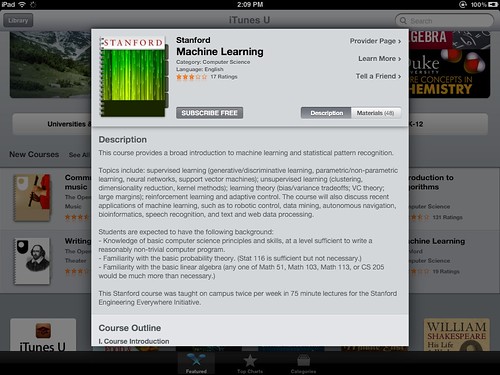
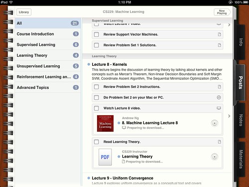
I've now watched a significant portion of Andrew Ng's Stanford Machine Learning course on iTunes U. I have taken several Machine Learning [classroom] courses, I've read many Machine Learning books and technical papers, I've done research on Machine Learning, and I've also taught Machine Learning. In short, I already know all the material in this course; watching it is mostly entertainment and professional curiosity.
And I still find the lectures harder to follow than a simple textbook.
(That's a lecture format problem, not a Andrew Ng problem.) The supplemental materials help, but they are essentially class notes in PDF format. (There are some problem sets, but no affordances for the general audience to get them graded.)
In lieu of, or to complement, this online course, here are a couple of non-interactive Machine Learning textbooks available online -- legally; posted by their authors:
Yes, an interactive textbook with Matlab (or Octave or R) programming affordances would be better than a non-interactive textbook, especially if the reader received feedback on his/her performance. But I still don't see the point of watching someone talk through the ML points when reading them is much faster. Video is useful when demonstrating software, for example, but a screen capture would work better than a classroom shot for that.
Let me reiterate the golden rule of learning technical material: 1% lecture, 9% study, 90% practice. You still need the textbook (preferably with dynamic content where applicable and programming and testing affordances) and the job of the instructor is crucial (selecting the material, sequencing it, choosing the textbook, designing the assignments, grading the assignments; and someone must write the textbook, of course), but the learning happens when you can WRITE CODE AND INTERPRET RESULTS.
If that's hard on your self-esteem, then tough. Machines don't care.
Because there are too many different types of presentation for any sort of abstract training to be effective. So "presentation training" ends up – at best – being "presentation software training."
Learning about information design, writing and general verbal communication, stage management and stage presence, and operation of software and tools used in presentations may help one become a better presenter. But, like in so many technical fields, all of these need some study of the foundations followed by a lot of field- and person-specific practice.
I have already written pretty much all I think about presentation preparation; the present post is about my dislike of "presentation training." To be clear, this is not about preparation for teaching or training to be an instructor. These, being specialized skills – and typically field-specific skills – are a different case.
Problem 1: Generic presentation training is unlikely to help any but the most incompetent of presenters
Since an effective presentation is one designed for its objective, within the norms of its field, targeted to its specific audience, and using the technical knowledge of its field, what use is it to learn generic rules, beyond the minimum of information design, clarity in verbal expression, and stage presence?
(My understanding from people who have attended presentation training is that there was little about information design, nothing about verbal expression, and just platitudes about stage presence.)
For someone who knows nothing about presentations and learns the basics of operating the software, presentation training may be of some use. I think Tufte made this argument: the great presenters won't be goaded into becoming "death by powerpoint" presenters just because they use the software; the terrible presenters will be forced to come up with some talking points, which may help their presentations be less disastrous. But the rest will become worse presenters by focussing on the software and some hackneyed rules – instead of the content of and the audience for the presentation.
Problem 2: Presentation trainers tend to be clueless about the needs of technical presentations
The argument (which I wrote as point 1 in this post) is essentially that looking at a table, a formula, or a diagram as a presentation object – understanding its aesthetics, its information design, its use of color and type – is very different from looking at a table to make sense of the numbers therein, understand the implications of a formula to a mathematical or chemical model, and interpret the implications of the diagram for its field.
Tufte, in his attack on Powerpoint, talks about a table but focusses on its design, not how the numbers would be used, which is what prompted Donald Norman to write his critique; but, of all the people who could be said to be involved in presentation training, Tufte is actually the strongest advocate for content.
The fact remains that there's a very big difference between technical material which is used as a prop to illustrate some presentation device or technique to an audience which is mostly outside the technical field of the material and the same material being used to make a technical point to an audience of the appropriate technical field.
Presentation training, being generic, cannot give specific rules for a given field; but those rules are actually useful to anyone in the field who has questions about how to present something.
Problem 3: Presentation training actions are typically presentations (lectures), which is not an effective way to teach technical material
The best way to teach technical material is to have the students prepare by reading the foundations (or watching video on their own, allowing them to pace the delivery by their own learning speed) and preparing for a discussion or exercise applying what they learned.
This is called participant-centered learning; it's the way people learn technical material. Even in lecture courses the actual learning only happens when the students practice the material.
Almost all presentation training is done in lecture form, delivered as a presentation from the instructor with question-and-answer periods for the audience. But since the audience doesn't actually practice the material in the lecture, they may have only questions of clarification. The real questions that appear during actual practice don't come up during a lecture, and those are the questions that really need an answer.
Problem 4: Most presentation training is too narrowly bracketed
Because it's generic, presentation training misses the point of making a presentation to begin with.
After all, presentations aren't made in a vacuum: there's a purpose to the presentation (say, report market research to decision-makers), an audience with specific needs (product designers who need to understand the parameters of the consumer choice so they can tweak the product line), supporting material that may be used for further reference (a written report with the details of the research), action items and metrics for those items (follow-up research and a schedule of deliverables and budget), and other elements that depend on the presentation.
There's also the culture of the organization which hosts the presentation, disclosure and privacy issues, reliability of sources, and a host of matters apparently unrelated to a presentation that determine its success a lot more than the design of the slides.
In fact, the use of slides, or the idea of a speaker talking to an audience, is itself a constraint on the type of presentations the training is focussed on. And that trains people to think of a presentation as a lecture-style presentation. Many presentations are interactive, perhaps with the "presenter" taking the position of moderator or arbitrator; some presentations are made in roundtable fashion, as a discussion where the main presenter is one of many voices.
Some time ago, I summarized a broader view of a specific type of presentation event (data scientists presenting results to managers) in this diagram, illustrating why and how I thought data scientists should take more care with presentation design (click for larger):
(Note that this is specific advice for people making presentations based on data analysis to managers or decision-makers that rely on the data analysis for action, but cannot do the analysis themselves. Hence the blue rules on the right to minimize the miscommunication between the people from two different fields. This is what I mean by field-specific presentation training.)
These are four reasons why I don't like generic presentation training. Really it's just one: generic presentation training assumes that content is something secondary, and that assumption is the reason why we see so many bad presentations to begin with.
NOTE: Participant-centered learning is a general term for using the class time for discussion and exercises, not necessarily for the Harvard Case Method, which is one form of participant-centered learning.
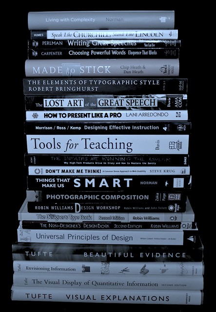
During a decluttering of my place, I had to make decisions about which books to keep; these are some that I found useful for teaching and presentations, and I'm therefore keeping:
They are stacked by book size (for stability), but I'll group them in four major topics: general presentation planning and design; teaching; speechwriting; and visuals design.
1. Presentation planning and design
Edward Tufte's Beautiful Evidence is not just about making presentations, rather it's about analyzing, presenting, and consuming evidence.
Lani Arredondo's How to Present Like a Pro is the only "general presentation" book I'm keeping (and I'm still pondering that, as most of what it says is captured in my 3500-word post on preparing presentations). It's not especially good (or bad), it's just the best of the "general presentation" books I have, and there's no need for more than one. Whether I need one given Beautiful Evidence is an open question.
Donald Norman's Living With Complexity and Things That Make Us Smart are not about presentations, rather about designing cognitive artifacts (of which presentations and teaching exercises are examples) for handling complex and new units of knowledge.
Chip and Dan Heath's Made to Stick is a good book on memorability; inasmuch as we expect our students and audiences to take something away from a speech, class, or exec-ed, making memorable cognitive artifacts is an important skill to have.
Steve Krug's Don't Make Me Think is about making the process of interactions with cognitive artifacts as simple as possible (the book is mostly about the web, but the principles therein apply to presentation design as well).
Alan Cooper's The Inmates Are Running The Asylum is similar to Living With Complexity, with the added benefit of explicitly addressing the use of personas for designing complex products (a very useful product design tool for classes, I think).
I had other books on the general topic of presentations that I am donating/recycling. Most of them spend a lot of space discussing the management of stage fright, a problem with which I am not afflicted.
If I had to pick just one to keep, I'd choose Beautiful Evidence. (The others, except How To Present Like a Pro, are research-related, so I'd keep them anyway.)
Tools for teaching, by Barbara Gross Davis covers every element of course design, class design, class management, and evaluation. It is rather focussed on institutional learning (like university courses), but many of the issues, techniques, and checklists are applicable in other instruction environments.
Designing effective instruction, by Gary Morrison, Steven Ross, and Jerrold Kemp, complements Tools for teaching. While Tools for Teaching has the underlying model of a course, this book tackles the issues of training and instruction from a professional service point of view. (In short: TfT is geared towards university classes, DEI is geared towards firm-specific Exec-Ed.)
I had other books on the general topic of teaching (and a number of books on academic life) that I am donating/recycling.
3. Speechwriting and public speaking
Speak like Churchill, stand like Lincoln, by James Humes, should be mandatory reading for anyone who ever has to make a public speech. Of any kind. Humes is a speechwriter and public speaker by profession and his book gives out practical advice on both the writing and the delivery. I have read many books on public speaking and this one is in a class of its own.
I have a few books from the Toastmasters series; I'm keeping (for now at least) Writing Great Speeches and Choosing Powerful Words, though their content overlaps a lot with Virginia Tufte's Beautiful Sentences, a book I'm definitely keeping as part of my writing set.
I'm probably keeping Richard Dowis's The Lost Art of The Great Speech as a good reference for styles and as motivation reading. (Every so often one needs to be reminded of why one does these things.)
I have other books on writing, in general, but the ones in the pile above are specific to speechwriting. I'm throwing out a few books on the business of speechwriting; they are so bad that I thought of keeping them as satire. Donating them would be an act of cruelty towards the recipients.
If I had to pick just one book on speechwriting, I'd go with Speak like Churchill, Stand like Lincoln. Hands down the best in the category, and I've read many.
4. Visuals design
Yes, the design of visuals for presentations or teaching, not Visual Design the discipline.
Edward Tufte's books are the alpha and the omega in this category. Anyone with any interest in information design should read these books carefully and reread them often.
The Non-Designer Design Book, by Robin Williams lets us in on the secrets behind what works visually and what doesn't. It really makes one appreciate the importance of what appears at first to be over-fussy unimportant details. I complement this with The Non-Designer Type Book and Robin Williams Design Workshop, the first specifically for type, the second as an elaboration of the Non-Designer Design Book.
Perhaps I'm a bit focussed on typography (a common symptom of reading design books, I'm told), but Robert Bringhurst's The Elements of Typographic Style is a really good and deeply interesting book on the subject. Much more technical than The Non-Designer Type Book, obviously, and the reason why I hesitate to switch from Adobe CS to iWork for my handouts.
Zakia and Page's Photographic Composition: A visual guide is very useful as a guide to laying out materials for impact. Designing the visual flow of a slide (or a handout) -- when there are options, of course, this is not about "reshaping" statistical charts -- helps tell a story even without narration or animation.
I had some other books on the general topic of slide design, which I am donating. I also have a collection of books on art, photography, and design in general, which affords me a reference library. (That collection I'm keeping.)
If I had to pare down the set further, the last ones I'd give up are the four Tufte books. If forced to pick just one (in addition to Beautiful Evidence, which fills the presentation category above), I'd choose The Visual Display of Quantitative Information, because that's the most germane to the material I cover.
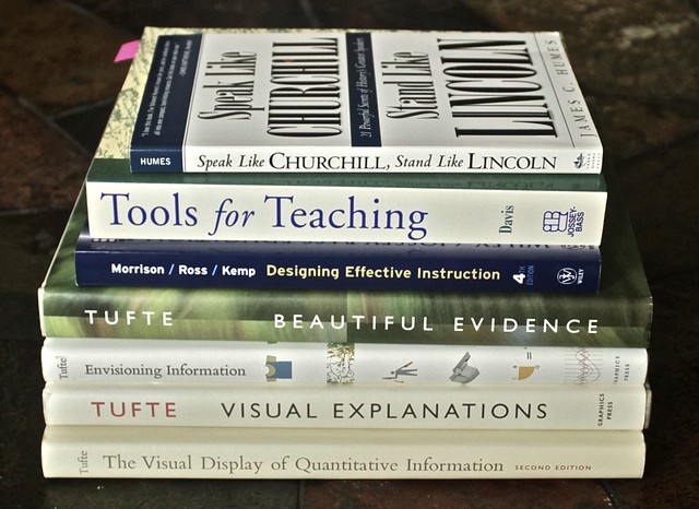
CODA: A smaller set
Not that I'm getting rid of the books in the larger set above (that's the set that I'm keeping), but I think there's a core set of books I should reread at least once a year. Unsurprisingly, those are the same books I'd pick if I really could have only one per category (or one set for the last category):
Note that the Norman, Heath Bros, Krug, Cooper books and my collection of art, photography, and design books are exempted from this choice, as they fall into separate categories: research-related or art. I also have several books on writing (some of them here).
And the books that didn't make the pile at the beginning of the post? Those, which I'm donating or recycling, make up a much larger pile (about 50% larger: 31 books on their way out).
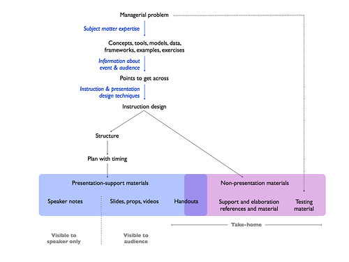
The title bears repeating, as many people confuse instruction and presentation preparation skills and criteria for success: Preparing instruction is different from preparing presentations.
I made a diagram depicting my process of preparing for a instruction event (the diagram was for my personal use, but there's no reason not to share it; click for larger):
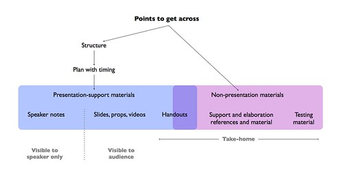
And, for comparison, the process for preparing presentations:
Because they look similar, I need to point out that the tools used in each phase of the process are different for presentations and for instruction.
I'm a big fan of participant-centered learning (though not necessarily the HBS cases that people always associate with PCL); the idea is simple: students learn from doing, not from watching the instructor do. So, many of the "materials" (more precisely, most of the time in the "plan with timing" part of the diagram) in an instruction event are audience work: discussions, examples brought by the audience (to complement those brought by the instructor) and exercises. These are not materials that can be used in a speech or a presentation to a large audience.
Also, while a story works as a motivator for both presentations and instruction, I tend to use exercises or problems as motivators for instruction. For example, I start a class on promotion metrics by asking "how do you measure the lift" of some promotional activity, and proceed from there. By making it a management task that they have to do as part of their jobs, I get some extra attention from the audience. Plus, they can immediately see how the class will help them with their jobs.*
There are presentations that are mostly for instruction purposes, and there are parts of instruction events that are presentations. But never mistake one for the other: preparing instruction is different from preparing presentations.
Though so much instruction is so poorly prepared that even the basics of presentation preparation will help make instruction less of a disaster, that's just a step towards instruction-specific preparation.
- - - - - - - - - - - -
*I have a large variety of exercises for each knowledge unit I teach, and they are not all of the form "here's a problem, what's the solution?" Some are of the forms "here's what a company is doing, what are they trying to achieve?" and "here's a problem, here's what the company is doing, what is wrong with that?"
Tools for teaching, by Barbara Gross Davis covers every element of course design, class design, class management, and evaluation. It is rather focussed on institutional learning (like university courses), but many of the issues, techniques, and checklists are applicable in other instruction environments.
Designing effective instruction, by Gary Morrison, Steven Ross, and Jerrold Kemp, complements Tools for teaching. While TfT has the underlying model of a class, this book tackles the issues of training and instruction from a professional service point of view. (In short: TfT is geared towards university classes, DEI is geared towards firm-specific Exec-Ed.)
No, not "empower yourself" books and seminars. Of those I cannot speak. Presentation and teaching books and seminars, that's what I'm talking about. It all starts with this picture (click to enlarge):
I made that picture one evening, as entertainment. I was cleaning up my hard drive and started perusing old teaching materials; noticed the different styles therein; and decided to play around with InDesign. After a while I ended up putting online something that I believe has useful content. It includes some references, which is what I'm writing about here.
Though I'm writing about the references, I cannot overemphasize the importance of the seminars. Tufte's books explain all the material (and the seminar's potential value is realized only after studying the books); but the seminar provides a clear example that it works. Some may read the books and go back to outline-like bullet point disaster slides because they don't trust the approach to work with a live audience. Tufte's seminar allays these fears.
The HBS seminar is more specific to teaching, but for those of us in the knowledge diffusion profession it's full of essential information. There are books on the case method and participant-centered learning, but they are not comparable to the seminar. I know, because I read the books before. And when the seminar started I was skeptical. Very skeptical. And when the seminar ended I reflected on what had happened - the instructor had made us, the audience learn all the material I had read about, without stating anything about it. Reading a book about the classroom skill would be like reading a book about complicated gymnastics.
But, even if one cannot attend these seminars, here are some references that help:
Brain rules, by John Medina, uses neuroscience to give life advice. There are many things in it that apply to teaching and learning; in addition, the skill with which Medina explains the technical material and the underlying science to a popular audience, without dumbing it down, is a teaching/presentation tool to learn (by his example).
Things that make us smart, by Donald Norman, a book about cognitive artifacts, i.e. objects that amplify brain powers. I also recommend his essay responding to Tufte, essentially agreeing with his principles but disagreeing with his position on projected materials.
Speak like Churchill, stand like Lincoln, by James Humes, should be mandatory reading for anyone who ever has to make a public speech. Of any kind. Humes is a speechwriter and public speaker by profession and his book gives out practical advice on both the writing and the delivery. I have read many books on public speaking and this one is in a class of its own.
The non-designer design book, by Robin Williams lets us in on the secrets behind what works visually and what doesn't. It really makes one appreciate the importance of what appears at first to be over-fussy unimportant details.
Tools for teaching, by Barbara Gross Davis covers every element of course design, class design, class management, and evaluation. It is rather focussed on institutional learning (like university courses), but many of the issues, techniques, and checklists are applicable in other instruction environments.
These references helped me (a lot), but they are just the fundamentals. To go beyond them, I recommend:
Donald Norman's other books, as illustrations of how cognitive limitations of people interact with the complexity of all artifacts.
Robin Williams design workshop, which goes beyond the non-designers design book. E.g.: once you understand the difference between legibility (Helvetica) and readability (Times), you can now understand why one is appropriate for chorus slides (H) and the other for long written handouts (T).
On writing well, by William Zinsser. This book changed the way I write. It may seem orthogonal to presentations and teaching, but consider how much writing is involved in class preparation and creation of supplemental materials.
Designing effective instruction, by Gary Morrison, Steven Ross, and Jerrold Kemp, complements Tools for teaching. While TfT has the underlying model of a class, this book tackles the issues of training and instruction from a professional service point of view. (In short: TfT is geared towards university classes, DEI is geared towards firm-specific Exec-Ed.)
As usual, information in this post is provided only with the guarantee that it worked for me. It may - probably will - work for others. I still stand by the opener of my post on presentations:
Online learning is teaching us a lot. Mostly about reasoning fallacies: of those who like it and of those who don't.
Let us first dispose of what is clearly a strawman argument: no reasonable person believes that watching Stanford computer science lectures on YouTube is the same as being a Stanford CS student. The experience might be similar to watching those lectures in the classroom, especially in large classes with limited interaction, but lectures are a small part of the educational experience.
A rule of thumb for learning technical subjects: it's 1% lecture (if that); 9% studying on your own, which includes reading the textbook, working through the exercises therein, and researching background materials; and 90% solving the problem sets. Yes, studying makes a small contribution to learning compared to applying the material.
Good online course materials help because they select and organize topics for the students. By checking what they teach at Stanford CS, a student in Lagutrop (a fictional country) can bypass his country's terrible education system and figure out what to study by himself.
Textbooks may be expensive, but that's changing too: some authors are posting comprehensive notes and even their textbooks. Also, Lagutropian students may access certain libraries in other countries, which accidentally on purpose make their online textbooks freely accessible. And there's something called, I think, deluge? Barrage? Outpouring? Apparently you can find textbooks in there. Kids these days!
CS has a vibrant online community of practitioners and hackers willing to help you realize the errors of your "problem sets," which are in fact parts of open software development. So, for a student who wants to learn programming in Python there's a repository of broad and deep knowledge, guidance from universities, discussion forums and support groups, plenty of exercises to be done. All for free. (These things exist in varying degrees depending on the person's chosen field -- at least for now.)
And, by working hard and creating things, a Lagutropian student shows his ability to prospective employers, clients, and post-graduate institutions in a better country, hence bypassing the certification step of going to a good school. As long as the student has motivation and ability, the online learning environment presents many opportunities.
But herein lies the problem! Our hypothetical Lagutropian student is highly self-motivated, with a desire to learn and a love of the field. This does not describe the totality of college students. (On an related statistical note, Mickey D's has served more than 50 hamburgers.)
The Dean of Old Mizzou's journalism school noticed that students who downloaded (and presumably listened to) podcasts of lectures retained almost twice as much as students in the same classes who did not download the lectures. As a result, he decreed that henceforth all journalism students at Old Mizzou would be required to get an iPod, iPhone, or similar device for school use.
Can you say "ignoring the selection effect"?
Students who download lectures are different from those who don't: they choose to listen to the lectures on their iPod. Choose. A verb that indicates motivation to do something. No technology can make up for unmotivated students. (Motivating students is part of education, and academics disagree over how said motivation should arise. N.B.: "education" is not just educators.)
Certainly a few students who didn't download lectures wanted to but didn't own iPods; those will benefit from the policy. (Making an iPod required means that cash-strapped students may use financial aid monies to buy it.) The others chose not to download the lectures; requiring they have an iPod (which most own anyway) is unlikely to change their lecture retention.
This iPod case scales to most new technology initiatives in education: administrators see some people using a technology to enhance learning, attribute that enhanced learning to the technology, and make policies to generalize its use. All the while failing to consider that the learning enhancement resulted from the interaction between the technology and the self-selected people.
This is not to say that there aren't significant gains to be made with judicious use of information technologies in education. But in the end learning doesn't happen on the iPod, on YouTube, on Twitter, on Internet forums, or even in the classroom.
Learning happens inside the learner's head; technology may add opportunities, but, by itself, doesn't change abilities or motivations.