Let $f(x)$, $f \in \mathrm{C}^{\infty}$, be the following infinitely continuously differentiable function over the space of real numbers:
\[ f(x) \doteq \sum_{n=0}^{\infty} \frac{e^{-2} \, 2^n}{n!} + \frac{1}{\sqrt{2 \, \pi}}\int_{-\infty}^{+ \infty} x \, \exp(-y^2/2) \, dy; \] then, applying Taylor's theorem and the Newton–Leibniz axiom,
\[f(1) = 2.\]
Time out! What the Heck?!?!
Okay. Breathe.
Let's restate the above in non-pompous terms.
Let $f(x)$ be the following function \[f(x) = 1 + x\] then $f(1) = 2$.
All the words between "following" and "function" in the first paragraph mean "smooth," which this function certainly is; $f \in \mathrm{C}^{\infty}$ is the formal way to say all the words in that sentence, so it's redundant.
As for the complicated formula, it uses a series and an integral that each compute to one. Eagle-eyed readers will notice that the first is the Taylor series expansion of $e^2$ times the constant $e^{-2}$ and the second is $x$ times the integral of the p.d.f. for the Normal distribution for $y$, which by definition of a probability has to integrate to 1. Taylor's theorem and Newton–Leibniz axiom are used to get the values for the series and the integral from first principles, as is done in first-year mathematical analysis classes, and which no one would ever use in a practical calculation.
I took a trivially simple function and turned it into a complicated, nay, scary formula. With infinite sums, integrals, and theorems. Taylor is relatively unknown, but Newton and Leibniz? Didn't they invent calculus? (Yes.) So my nonsensical formula acquires immense gravitas. Newton! And Leibniz!!
And that's the problem with an increasing number of public intellectuals and technical material.
There are some genuinely complex things out there, and to even understand the problems in some of these complex things one needs serious grounding in the tools of the field. There's no question about that. But there's a lot of deliberate obfuscation of the clear and unnecessary complexification of the simple.
Why? And what can we do about it?
Why does this happen? Because, sadly, it works: many audiences incorrectly judge the competence of a speaker or writer by how hard it is to follow their logic. And many speakers and writers thus create a simulacrum of expertise by using jargon, dropping obscure references and provisos into the text, and avoiding simple, clear examples in favor of complex and hard-to-follow, "rich," examples.
What can we do about it? This is a systemic problem, so individual action will not solve it. But there's one thing we each can do: starve the pompous of the attention and recognition they so crave. In other words, and in a less pompous phrasing, when we realize someone is purposefully obfuscating the clear and complexifying the simple, we can stop paying attention to them.
Simplicity actually requires more competence than haphazard complexity; it requires the ability to separate what is essential from what's ancillary. To make things, as Einstein said, as simple as possible, but no simpler.
It's also a good thinking tool for general use. Feynman describes how he used to follow complicated topological proofs by thinking of balls, with hair growing on them, and changing colors:
As they’re telling me the conditions of the theorem, I construct something which fits all the conditions. You know, you have a set (one ball)—disjoint (two balls). Then the balls turn colors, grow hairs, or whatever, in my head as they put more conditions on. Finally they state the theorem, which is some dumb thing about the ball which isn’t true for my hairy green ball thing, so I say, “False!”
If it’s true, they get all excited, and I let them go on for a while. Then I point out my counterexample.
“Oh. We forgot to tell you that it’s Class 2 Hausdorff homomorphic.”
“Well, then,” I say, “It’s trivial! It’s trivial!” By that time I know which way it goes, even though I don’t know what Hausdorff homomorphic means.
Excerpt From: Richard Feynman, “Surely You’re Joking, Mr. Feynman: Adventures of a Curious Character.”
Let's strive to be like Einstein and Feynman.
- - - - - This post was inspired by an old paper that starts with $1+1=2$ and ends with a multi-line formula, but I've lost the reference; it might have been in the igNobel prizes collection.
Yes, the first observation is that I am a science geek. Some people binge-watch Kim Cardassian, some people binge-watch Netflix, some people binge-watch sports; I binge-watch college lectures on subjects that excite me.
(This material has no applicability to my work. Learning this material is just a hobby, like hiking, but with expensive books instead of physical activity.)
To be fair, this course isn't a MOOC; these are lectures for a live audience, recorded for students who missed class or want to go over the material again.
The following is the first lecture of the course, and to complicate things, there are several different courses from UC-Stalingrad with the same exact name, which are different years of this course, taught by different people. So kudos for the laziness of not even using a playlist for each course. At least IHTFP does that.
(It starts with a bunch of class administrivia; skip to 7:20.)
Production values in 2013, University of California, Berkeley
To be fair: for this course. There are plenty of other UC-Leningrad courses online with pretty good production values. But they're usually on subjects I already know or have no interest in.
Powerpoint projections of scans of handwritten notes; maybe even acetate transparencies. In 2013, in a STEM department of a major research university. Because teaching is, er…, an annoyance?
The professor points out that there's an error in the slide, that the half-life of $^{232}\mathrm{Th}$ is actually $1.141 \times 10^{10}$ years, something that he could have corrected before the class (by editing the slide) but decided to say it in class instead, for reasons...?
The real problem with these slides isn't that handwriting is hard to read or that use of color can clarify things; it's the clear message to the students that preparing the class is a very low priority activity for the instructor.
A second irritating problem is that the video stream is a recording of the projection system, so when something is happening in the classroom there's no visual record.
As a former and sometimes educator, I don't believe in the power of lectures without practice, so when the instructor says something like "check at home to make sure that X," I stop the video and check the X.
For example, production of a radioactive species at a production rate $R$ and with radioactive decay with constant $\lambda$ is described by the equation at the top of the highlighted area in the slide above and the instructor presents the solution on the bottom "to be checked at home." So, I did:
Simple calculus, but makes for a better learning experience. (On a side note, using that envelope for calculations is the best value I've received from the United frequent flyer program in years.)
This, doing the work, is the defining difference between being a passive recipient of entertainment and an active participant in an educational experience.
Two tidbits from the early lectures (using materials from the web):
Binding energy per nucleon explains why heavy atoms can be fissioned and light atoms can be fused but not the opposite (because the move is towards higher binding energy per nucleon):
The decay chains of Uranium $^{235}\mathrm{U}$ and Thorium $^{232}\mathrm{Th}$:
(Vertical arrows are $\alpha$ decay, diagonals are $\beta$ decay.)
Unfair comparison: The Brachistochrone video
It's an unfair comparison because the level of detail is much smaller and the audience is much larger; but the production values are very high.
Or maybe not so unfair: before his shameful (for MIT) retconning out of the MIT MOOC universe, Walter Lewin had entire courses on the basics of Physics with high production values:
(I had the foresight to download all Lewin's courses well before the shameful retconning. Others have posted them to YouTube.)
Speaking of production values in education (particularly in Participant-Centered Learning), the use of physical props and audience movement brings a physicality that most instruction lacks and creates both more immersive experience and longer term retention of the material. From Lewin's lecture above:
(To protect the guilty, the presenter will be called "Epic," short for "Epic Fail II," and without loss of generality will be referred to with masculine pronouns.)
Epic committed three cardinal sins of presentations (there are more than three and some of the others were present in the terrible talk), in increasing order of badness:
The sin of humming:
"Hum... like... basically..." were Epic's most common words. Or sounds, more precisely, because that's what they are. Sounds that Epic made as his brain composed the sentence that was to come.
This is the main problem of using slides-as-presenter-notes, though it also happens to presenters who have separate "talk skeleton" notes and don't rehearse a few times: bullet points aren't feasible out-loud sentences, so, to unprepared presenters, they act as stumbling blocks rather than helpful hints.
Some people are very articulate; some can be articulate from notes; most of the others need to do at least one run-through of the notes, preferably to camera so they can review it. The camera is essential, as without feedback there's little improvement.
Humming is a sign the presenter didn't care enough for the audience to rehearse his presentation.
The sin of non-preparedness:
Like most presenters, Epic seems to have created his presentation in a small fraction of the presentation time. That's usually a recipe for disaster. While some people can make good presentations impromptu or quasi-impromptu, most presenters should prepare carefully.
Epic's presentation had no clear objectives, no clear structure, and above all, no clear arguments. For comparison, there was another presenter at the conference who, in order to explain a programming philosophy created a motivating example based on refactoring a cookbook.
The procedure for preparing isn't complicated: decide what the presentation objectives are; decide how they sequence into each other; devise ways to explain these objectives; assemble the presentation; rehearse.
Epic skipped all these stages, except the assembling of the presentation as a sequence of presenter-notes-on-slides, but without actually thinking much about what each point. Epic didn't think about the phrasing of the points (see previous sin), let alone consider how to best explain them to the audience.
Good presentations begin in the preparation; bad presentations in the lack of it.
The sin of self-absorption:
The audience was promised, and therefore expected, a technical talk about a technical tool. Epic delivered a presentation about Epic: Epic's education (really, a CV slide and multiple name-drops to Epic's school, Epic's degree, Epic's degree advisor); Epic's actions ("I did this," "I found that" not "data show" or "tool does this"); Epic's performance on Epic's job (via repeated references to a sort of limited field contests/competitions, to which the audience groan was the only appropriate answer).
Two other presenters in the same session described highly technical tools, barely ever using the first person, talking about the tools, offering interesting if technically challenging knowledge. That's because, unlike Epic, they understood that the audience wasn't there to learn about the presenters' lives, but rather about the tools.
Epic, like many terrible presenters, bought into the idea that every presentation has to be a story (more or less right, even for a technical audience) about the presenter (absolutely wrong, unless you're presenting an autobiography).
Audiences don't like bait-and-switch: deliver what was promised, not what you like.
Use longer, content-heavier handouts; integrate local and up-to-date content; and show numbers and math.
Change 1: Longer and content-heavier handouts
The only significant complaint from previous cohorts was regarding the lack of a textbook. I post a selection of materials to the course support intranet (consultancy reports, managerial articles, academic papers, book chapters), but a few students always remark on the lack of a unifying text for the class.
(There's no unifying text because -- in my never humble opinion -- most Consumer Behavior textbooks are written from a consumer psychology point of view, while I prefer a more marketing engineering point of view.)
Taking that into consideration, I made longer, denser handouts, each like a book chapter rather than just support for in-class activities. The class is participant-centered, with minimal lecturing, so these longer handouts help students feel that they have a coherent framework to fall back on.
Handouts changed from a median size of four pages of mostly diagrams, in 2012, to a median size of eighteen pages of text, diagrams, and numbers, in 2014. (Just a reminder, since there's some confusion about it, that handouts and slides serve different purposes.)
Change 2: More local content
I used local content in most class sessions: local products, merchandizing from local retailers, and examples from local advertising. In particular, using outdoors from around the campus allowed students to recognize their location, for a little a-ha moment that improves mood.
The main advantage of local content is student familiarity with it. Examples are more effective when students don't have to learn new brands, new product categories, and other regional differences. A disadvantage is additional preparation work, but that work also signals to the students the instructor's commitment to the class.
A secondary advantage of local content is as evidence of instructor competence. Local content, and up-to-date content, requires confidence, ability, and practice. For this reason alone, it's worth the additional work, even if old or foreign examples would be equally good for teaching.
Change 3: More numerical content
The rise of analytics is a highly visible trend in marketing; marketing courses are therefore increasingly quantitative. Still, most Consumer Behavior courses shy away from math.
Our course was different: there were plenty of numbers and models. I did most of the work, not the students, since the objective was not to teach them analytics; but I did do the work, so the students were shown modern marketing techniques rather than a lot of hand-waving.
For example, to illustrate the effects of memory on different types of advertising timing, I used a computer simulation of a learning model: instead of rules-of-thumb for media planning, students saw how learning and forgetting rates change the effectiveness of blitz versus pulsing media timing.
(References to technical materials were provided for students wishing to learn more, of course.)
Results
Despite objectively covering more material than before and using harder assessment measures, student grades were higher. In other words, these changes achieved their primary objective: students learned more material and learned it better.
Class dynamics were better than before, though they were pretty good in previous years. When I pick up my teaching evals in 2016 (they're on paper), I'll know whether I kept my top-5 ranking from 2012.
Addendum: In short events since the MBA class, I replicated these three changes, yielding performance improvements along all dimensions: participant learning (as measured by in-event exercises), participant experience (as measured by client-run event evaluations), follow up contact with the participants, and word-of-mouth.
"The scientists that I respect are scientists who work hard to be understood, to use language clearly, to use words correctly, and to understand what is going on. We have been subjected to a kind of word salad of scientific jargon, used out of context, inappropriately, apparently uncomprehendingly." – Richard Dawkins, in the video Dangerous Ideas - Deepak Chopra and Richard Dawkins, approximately 27 minutes in.
That's how I feel about a lot of technical communications: conference panels, presentations, and articles. An observed regularity: the better the researchers, the less they tend to go into "word salad of scientific jargon" mode.
If you want to become a better presenter, you probably should avoid most advice about presentations.
Yes, here I am, an educator, apparently telling people to avoid sources of knowledge. The problem is that much presentation advice is not a source of knowledge; more like a source of sophistry that helps perpetuate some of the worst problems with presentations.
As an avid reader of books, articles, and blog posts about presentations, I identified a few pathologies from the mass of material available:
1. Presentationism. This is what I call the tendency of people who do presentation training or information design training to focus on the style and delivery of the presentation instead of the substantive material that the presentation is about. This is a form of professional deformation, but one that can become a serious obstacle to understanding the real value of presentation skills: usually that of changing the audience's mind, unless the presentation is being done for entertainment, legal, or other purposes.
2. Perfectionism. The idea that all presentations have to be done to the standard of excellence and that all presenters should put as much effort as needed into preparing, rehearsing, delivering, and clarifying every presentation. In reality there are many people who have to do presentations with minimal resources, for whom the time and effort required to create a better presentation represent a net loss of value.
3. Ideological purity. Instead of choosing the best tool for a given presentation, many authors are strict ideologues: the presentation should conform to their choice of tool and styles. This affects some famous authors in information design and presentation techniques, and has led to pointless arguments about which tool is better, tout court. Like arguing whether a hammer or a drill is a better tool, independently of the project, and equally pointless. This creates a subordinate problem:
4. Subject matter and audience independence. According to a plurality of authors, Einstein presenting to an audience of Princeton scientists and the Frito-Lay head of sales for northeast Kentucky reporting on the penetration of new chip varieties to a group of mid-level executives should prepare and deliver their presentations in about the same manner, with similar presentation support (typically, though not always, slides), and about the same effort. To be clear, these authors don't suggest that the substance of the presentation should be the same, but rather that the process of preparing and delivering these presentations and the style and design of the materials should be the same.
5. The "tricks and tips" distraction. Many authors offer only tricks and tips, which may be good or bad, but in general create a false sense of learning: the problem with most bad presentations is systemic, not something that a tip will solve. Similarly, a lot of authors use cherry-picked results from psychology to support their approach. As a general rule, unless you can read the original source and determine whether the result applies to your circumstances, it's better to ignore this.
So, what is someone who wants to become a better presenter to do? I've written about it (note the "most" in the title above, which is not "all" on purpose), and here are three further recommendations:
- Edward Tufte's books, courses, and web site, despite a bit of ideological purity, are possibly the best source for people for whom getting complex messages across to their audience is important and worth the effort.
- Don Norman's critique of Tufte makes a good counterpoint piece for ET's works.
Above all, think critically about the advice being given; ask "does this make sense in my case?" Even the best advice has exceptions.
Cinema, especially documentaries, and the performing arts in general have a few useful lessons for presentations.
Of course, the main lesson regarding presentations is that preparation is key — just like with the performing arts. But this is a post about details rather than a rehashing of my big presentations post.
1. Have a script. A real script, like a movie script.
In the past I used the Donald Norman approach: have an outline, annotated with some felicitous turns of phrase (those work better if you figure them out in advance) and important facts and figures. But now I find that having a script is a great tool, even if I tend to go off-script early and often in a presentation:
a) It forces me to plan everything in detail before the first rehearsal. Then I can determine what works and what doesn't and adapt the script. (Just like in a movie production.)
b) It makes obvious when there's over-use of certain expressions, unintended aliteration, tongue twisters, and pronunciation traps. Not to mention embarrassing unnoticed double entendres.
c) It creates a visual representation of the spoken word, which lets me see how long some chains of reasoning are.
d) It serves as a security blanket, a mental crutch, especially when I'm lecturing in a language different from the one I speak all day at the lecture location (say, speak portuguese in Lisbon, listen to Puccini arias in italian, read Le Monde in french, and then have to capstone discussion classes with english lecturettes).
2. Explicitly write treatments on script
By writing the treatments (slide, board, video, interactive, prop, handout, demonstration, discussion, etc) explicitly into the script I can identify potential problems:
a) If there's a block of more than 750 words (i.e. about ten minutes) that has no treatments, it had better be an interesting story. If I think that the story could use some attention-grabbing treatment, I have time to figure out what to do as I write the script.
b) If there's a diagram on a projected material that requires several builds, and is marked as such on the script, I identify that as an opportunity for a step-by-step construction on the board. That change comes at a cost of production values (upon seeing my drawings, arts teachers suggested I follow a career in text- or numbers-based fields); the benefit is the physicality of the writing and the motion of the speaker. (Note: draw on board, turn, then speak. Even with a microphone, speaking into the board is bad practice, as the speaker cannot gauge the audience's reaction.)
c) By having a cue to the upcoming treatment, I can compensate for lag in equipment response. For example, in the script above I want the video to start as I finish my sentence "money can't buy taste or style." Given my equipment lag, I need to click the remote when I say "money" so that the words in the video follow mine without noticeable pause. (The pause would distract the audience, and direct some of their attention to the technology instead of the content. Obviously I don't say "let's see a video about that" or some such.)
d) Explicit treatments also make it easy to check whether I have all the materials ready and to make sure that I don't forget anything in the mise en scène before I start. (This is a particularly useful reminder to set up demonstrations and double-check props before the event.)
3. There's only one "take" on stage – so practice, practice, practice
The first practice talk is basically a check for design issues; many things that sound or appear adequate in one's mind ear or eye fail when said out loud, projected on a screen, or written on a board. After the first practice there's usually a lot of presentation materials rework to do. It goes without saying that failing to do this practice presentation means that the problems that would have been discovered during the practice will happen during the actual presentation – when it matters and in front of an audience.
A few iterations of this practice-analyze-rework (reminiscent of the draft-edit-redraft-edit- process for written word) should converge to a "gold master" talk. At this point practice will be for delivery issues rather than design issues: intonation, pronunciation, movement, posture, etc.
Full dress rehearsals, preferably in the presentation venue, are great tools to minimize surprises at the presentation time. I always try to get access to the venue ahead of time, preferably with the A/V people that will be there for the presentation.
If you feel ridiculous giving a full dress rehearsal talk to an empty room while the A/V people watch from their booth, just think how much more ridiculous it is to fail in front of an audience for lack of preparation.
(It goes without saying, but I said it before and will say it again, that practice is the last step in the preparation process before the presentation event; some presenters believe that practice can replace the rest of the preparation process, which is a grave error.)
4. Record and analyze presentations, even the practice ones
Given how cheap recording equipment is, there's no reason not to record presentations (except perhaps contractual restrictions).
The main reason for recording is quality control and continuous improvement; a second reason is to capture any impromptu moments of brilliance or interesting issues raised during the Q&A.
Depending on various arrangements and the presenter's approach to sharing, these recordings can also be part of the public portfolio of the presenter.
5. The Ken Burns effect - it's not a spurious animation
There are a few times when I have a few minutes worth of words that refer to or are supported by a photo. That photo is the projected material for those minutes, but I've started using very slow pans and zooms (the Ken Burns effect, after the PBS documentarian) to create a less boring experience.
My pragmatic guidelines for using the Ken Burns effect are:
a) Use sparingly: once, maybe twice in a presentation, and not in a row.
b) Very slow motion; the idea is to create a just-noticeable-difference so that there's something to keep the attention on the picture, but not enough to distract from what I'm saying.
c) The picture has to be high-resolution so that there's no pixelation.
d) In case of uncertainty, no effect. (Less is more.)
e) Since the photo supports the words I'm saying, and Keynote doesn't allow slide transitions in the middle of animations, the length of the effect has to be just short of the time it takes to say the words.
And a big difference from performing arts and documentaries: Every talk is new, even the canned ones.
Unless you're Evelyn Waugh, you don't want to give the same talk every time. Knowledge evolves, circumstances change, new examples appear in the media, and you learn new stuff from the question and answer period after a talk, or in the socializing period.
Having a script (and a master presentation a la Tom Peters) lets a speaker track the changes that a talk goes through over its lifecycle. It's an interesting exercise in itself, but also can give hints for how to adapt other "canned" talks one may have in one's portfolio.
Preparation, Practice, and Performance. Gee, it's like one of those management things where a complicated field is summarized by a few words that start with the same letter. But it's accurate.
It was the best of talks, it was the worst of talks.
(Yes, I understand that Dickens's opener has been used to the cliché limit; but the two examples I have in mind really bracket the space of possible talks. At least those talks with voluntary attendance.)
The best of talks: Michael Tilson Thomas at TED.
Even if you don't like art music, this talk is well worth watching for the presentation skills demonstrated by MTT:
MTT opens with a personal story of an interesting coincidence (his father's name was Ted); this is not my preferred type of opener, but he builds a personal narrative out of that opener and then merges it with his main topic very well.
MTT sits at a baby grand piano, which he occasionally plays to illustrate points about music evolution. This interactive production of the presentation material, similar to writing and running code or analyzing data in a technical presentation, has three main presentation advantages that make up for its risks:
1. Visual and physical variety, or more generally, presentation process variety. Every few seconds the image changes, the activity changes, the type of presentation changes: speaking, playing piano, describing a photo, narrating a video, watching a video without narration, listening to recorded music. Compare that with 18 minutes of speaking to slides bearing bullet points.
2. Clear demonstration of expertise, which projecting a video or playing recorded music cannot do. In a live demonstration or performance there's always a risk that something will go wrong, which is why many presenters avoid this kind of demonstration. But the willingness to take that risk is a strong signal to the audience of the presenter's competence and expertise.
3. Adaptability (not really used by MTT, since his was not a talk with audience interaction). This is particularly important in teaching technical material, I think: allowing the students to ask questions and see the answers come from the techniques that we're teaching them is a lot better than just showing them slides. (Of course real learning happens when the students do the work themselves, but this kind of demonstration helps begin the process and motivates them to act.)
The supporting materials were superbly chosen and executed. Credit here is due to a large supporting cast for MTT: this presentation uses materials and skills from the education and multi-media presence of the San Francisco Symphony, an organization whose main business is performing. But here are five important lessons that these materials illustrate:
1. No bullet points, and few words (mostly as subtitles for foreign language). The projected materials (including a large camera shot of MTT when no other materials are using the screen) are there to support what MTT is saying, not to remind MTT of what he wants to say.
2. The production values of the materials are professional (you can assess their quality on the 720p video) and that signals that this presentation is important to MTT, not something put together in the flight down, between checking email and imbibing airline liquor.
3. MTT's presentation never mentions the support, only the content: he doesn't say "this slide shows a photo of my father," he tells the story of discussing music with his father as the photo appears on screen. The photo is a support for the narrative instead of the narrative taking a detour to acknowledge the technology and the specifics of the material that is supporting it.
4. The interaction between materials, speech, and piano playing was choreographed in advance, with the video producer knowing which shots to use at each time. This comes from the extensive documentary and educational work of the San Francisco Symphony under MTT, but to some extent can be replicated by presenters of more technical material if they take the time to think of their presentation as a series of "cuts" in a video production.
5. It's not on the video, but it's obvious from the fluidity of the speaking, piano playing, and video materials that this talk was carefully planned and thoroughly rehearsed. That's not surprising: after all, a dress rehearsal is nothing new to a performing artist, and MTT clearly saw this talk as a performance. Most presenters would benefit from seeing their talks as performances (once they get the content part well taken care of, obviously).
The speech was well structured, with a strong opener and closer, repetition of the key points with different phrasing at the bridge points, and with the right mix of entertainment and education that is expected of a TED talk.
MTT had a teleprompter at his feet and notes on top of the piano, which in the video appear to include a couple of lines of music score, possibly as a reminder of the harmonic evolution he demonstrates at timecode 5:28 to 6:02. Many presenters are afraid that using speaker notes makes them look unprepared or "just reading their speech." This is an erroneous attitude for five reasons:
1. Expertise can be demonstrated in different ways, like MTT playing the piano. And as a general rule, the audience will have some idea of the expertise of the presenter, established ahead of time by other means.
2. Open discussion or question and answer periods allow the speaker to wow the audience with his or her ability to extemporize. (As a general rule, I suggest speakers prepare notes on some of the more likely questions that may need some thinking ahead, but not read them verbatim.)
3. Reading a speech is a difficult skill; most people can't do it correctly. Even when I write a speech for myself, I find that I also make notations on it and end up using it more as a psychological crutch than an actual speech to read. It's fairly obvious that MTT is not reading the speech verbatim.
4. Even if MTT is partially reading a prepared speech, it's most likely one that he had a big input in writing. Other than celebrities, politicians, and CEOs, most presenters will have written their speeches, and most audiences will expect that they did.
5. Ironically, many people who look down on unobtrusive speaker notes or teleprompters put their speaker notes on the screen as bullet points, confusing the materials that are there to help the speaker (notes) with the materials that are there to help the audience process the presentation (visual support).
The material MTT covers meshes with music history so he uses stories and storytelling as the main text form. Stories are one of the six tools for memorability the Heath brothers recommend in the book Made To Stick, and they work very well here. MTT also uses what Edward Tufte calls the P-G-P approach to exposition, presenting a Particular case first, then making a General point, then capstoning that point with another Particular example.
Dancing and singing aren't common techniques in presentations, but MTT uses them to great effect at timecode 2:24. In other presentations some acting or character impressions can be used for the same purpose: break the solemnity of the occasion, signal that you take the subject seriously but you don't take yourself too seriously, or to bridge topics.
(On a video that's no longer available online, John Cleese of Monty Python keeps interrupting his own presentation on creativity techniques with "How many X does it take to change a light bulb" jokes, as a way to give the audience breaks. And those jokes are part of a running arc that he established at the beginning of "there's no real training for creativity so I might as well spend my time telling jokes.")
Personally I don't recommend singing, dancing, or telling jokes in a talk unless you are a professional singer, dancer, or comedian, and even so only sparingly. Note that MTT did it for a very specific and memorable point: that a "piece of 18th Century Austrian aristocratic entertainment" turned into the "victory crow of [a] New York kid," and that's the atemporal power of music.
And as a closer, MTT rehashes the opening theme "what and how" and adds a cornerstone "why," ending on a good note and high energy. It's always important to have a strong closer, almost as important as a good opener.
Two minor observations:
1. MTT should have had a sip of water right before the talk and sloshed it around his mouth and lips, to avoid that smacking sound when he speaks. That sound is created by dryish areas in the mouth letting go at inappropriate times; sloshing the water solves it, drinking doesn't.
2. I assume that MTT's fleece was chosen to match his clothes and accessories, but he could have one custom-made in that color with the logo of the San Francisco Symphony. Maybe this is my crass commercialism rearing its ugly head, but with not flaunt the brand?
The worst of talks: a presenter who will remain anonymous at an undisclosed conference.
For clarity of exposition I'll call the presenter EF, for "Epic Fail," and use the pronoun "he" without loss of generality over gender.
EF started his presentation with a classic: computer trouble.
EF's talk was the last in a four-talk session; the other three presenters had installed their presentations in the podium computer during the break before the session, but EF did not. An alternative to using the podium computer would be to connect his laptop and test the setup during the pre-session break. A third possibility would be to connect his computer while the previous presenter was taking questions from the audience; personally I find this disruptive and avoid it, but it's better than what happened.
And what happened was that after four minutes of failed attempts to connect his computer to the podium (out of a total time per speaker of twenty minutes, including the Q&A period), EF asked the audience for a flash drive so he could transfer his presentation to the podium computer.
Presentation starts after six minutes of unnecessary computer-related entropy.
The room where this happened was an executive education classroom, with U-shaped seating, two projection screens side-by-side at the front and large flat screen TVs on the side walls so that the people on the straight part of the U could look at them instead of the front screens. These TVs also serve as a way for the presenter to see what's on screen while looking towards the audience.
Which is why everyone was puzzled when EF walked to one side of the front screens, turned his back to the audience and started talking in a monotone, while -- apparently -- clicking the remote at random. Really: he moved his slides up and down apparently at random and at high speed, maybe one-second on screen per slide, and without any connection to what he was saying.
But that's fine, because what he was saying was also disconnected within itself. In fact, I don't think he had any idea -- let alone a clear idea -- of what he wanted the audience to take away from the talk.
As far as I could gather, from reading the abstract about four times until I made some sense of it by writing a modal logic model of the essential words therein and crossing the 90% of words that were filler: there's a well-established phenomenon that is observable in a series of measures $X(p)$ as we vary the parameter $p$. The presentation was about changing the parameter space from $P_1$ to $P_2$, with $P_1 \subset P_2$. All tests in the literature concern themselves with the effects measured in $P_1$, and this paper tests the effects in $P_2$. This was not clear in the abstract or the presentation.
One of the slides that was on-screen several times, for about 4 seconds at a time, showed a table with the results from the literature, that is $X(p), p\in P_1$. Every time EF wanted to say something about these results, he moved several slides up and down, looking for the bullet point he wanted -- a point about the table that he had therefore removed from the screen. But that's not the worst.
After spending ten minutes explaining to an audience of experts in the subject matter a well-known point in the field of their expertise, EF glossed over details of his measurement technique, experimental procedure, and data processing, and presented his table of $X(p), p\in P_2$.
Without the $X(p), p\in P_1$ values for comparison.
Let me repeat that: he presented his results, which are to be compared and contrasted to the established results, on a separate table. Now, the phenomenon is well-established, but this is a table of numbers with three or four significant digits, so the details aren't that easy to recall. They are even harder to recall when EF keeps changing slides to look for bullet points about this table, again removing the table from the screen. Let me also point out that these are about 12 rows of 2 numbers per row, 4 with the comparison, well within the capacity of a one-slide table.
Every so often EF would stop abruptly in the middle of a sentence and silently move his slides up and down looking for something, then start a whole new sentence, without stopping the up-and-down movement of the slides.
But the clincher, the payoff after this painful exercise?
EF had no conclusions. His team was still analyzing the data, but so far it appeared that there was no change at all from the well-established phenomenon.
Now, in many fields, showing that a well-established phenomenon applies beyond the boundaries of the previous experiments is a valuable contribution. But in this case the expansion from $P_1$ to $P_2$ was trivial at best.
At this point, and about four minutes over time, EF invited the audience to ask questions. There were no takers, so EF asked one of the audience members (presumably an acquaintance) what he thought of some minor detail that EF had actually not talked about. The audience member said something noncommittal, and EF pressed the point, trying to get a discussion going. The rest of the audience was packed and ready to leave, but EF paid them as much attention during this failed attempt at a dialog as he had during his failed attempt at a presentation.
I was told later by another attendee that this presentation was not atypical for EF.
MTT is a performing artist, a showman by profession. The presentation he delivered was designed by a support team of graphic artists, cinematographers, writers: it fits within the education efforts of the San Francisco Symphony. MTT's audience is mostly there for entertainment and positively predisposed towards the celebrity presenter. His material is naturally multi-media, interactive, and pleasant, requiring very little effort on the audience part to process it. And, let's not forget, the presentation event itself was a team effort -- MTT is not operating the video screen or the teleprompter at his feet.
EF is a researcher and a professor. His presentation was designed by him, an untrained presenter (obvious from the talk), and delivered to an academic audience: hard to impress, critical, and possibly even hostile. His material is technical, dry, and requires significant effort (even in the best circumstances) to process and follow. He didn't have a teleprompter (though he could have speaker notes had he chosen to) nor a presentation support team.
So, yes, it seems that I'm being unfair in my comparison.
Except that there were, in that very same conference, three keynote speakers with equally dry, non-multimedia, hard to process material, who did a great job. They varied a lot in style and delivery but all made their points clear and memorable, kept their presentations moving along, and didn't use their projected materials as a crutch.
Above all, they had something interesting and important to say, they knew precisely what it was, and they made sure the audience understood it.
Because there are too many different types of presentation for any sort of abstract training to be effective. So "presentation training" ends up – at best – being "presentation software training."
Learning about information design, writing and general verbal communication, stage management and stage presence, and operation of software and tools used in presentations may help one become a better presenter. But, like in so many technical fields, all of these need some study of the foundations followed by a lot of field- and person-specific practice.
I have already written pretty much all I think about presentation preparation; the present post is about my dislike of "presentation training." To be clear, this is not about preparation for teaching or training to be an instructor. These, being specialized skills – and typically field-specific skills – are a different case.
Problem 1: Generic presentation training is unlikely to help any but the most incompetent of presenters
Since an effective presentation is one designed for its objective, within the norms of its field, targeted to its specific audience, and using the technical knowledge of its field, what use is it to learn generic rules, beyond the minimum of information design, clarity in verbal expression, and stage presence?
(My understanding from people who have attended presentation training is that there was little about information design, nothing about verbal expression, and just platitudes about stage presence.)
For someone who knows nothing about presentations and learns the basics of operating the software, presentation training may be of some use. I think Tufte made this argument: the great presenters won't be goaded into becoming "death by powerpoint" presenters just because they use the software; the terrible presenters will be forced to come up with some talking points, which may help their presentations be less disastrous. But the rest will become worse presenters by focussing on the software and some hackneyed rules – instead of the content of and the audience for the presentation.
Problem 2: Presentation trainers tend to be clueless about the needs of technical presentations
The argument (which I wrote as point 1 in this post) is essentially that looking at a table, a formula, or a diagram as a presentation object – understanding its aesthetics, its information design, its use of color and type – is very different from looking at a table to make sense of the numbers therein, understand the implications of a formula to a mathematical or chemical model, and interpret the implications of the diagram for its field.
Tufte, in his attack on Powerpoint, talks about a table but focusses on its design, not how the numbers would be used, which is what prompted Donald Norman to write his critique; but, of all the people who could be said to be involved in presentation training, Tufte is actually the strongest advocate for content.
The fact remains that there's a very big difference between technical material which is used as a prop to illustrate some presentation device or technique to an audience which is mostly outside the technical field of the material and the same material being used to make a technical point to an audience of the appropriate technical field.
Presentation training, being generic, cannot give specific rules for a given field; but those rules are actually useful to anyone in the field who has questions about how to present something.
Problem 3: Presentation training actions are typically presentations (lectures), which is not an effective way to teach technical material
The best way to teach technical material is to have the students prepare by reading the foundations (or watching video on their own, allowing them to pace the delivery by their own learning speed) and preparing for a discussion or exercise applying what they learned.
This is called participant-centered learning; it's the way people learn technical material. Even in lecture courses the actual learning only happens when the students practice the material.
Almost all presentation training is done in lecture form, delivered as a presentation from the instructor with question-and-answer periods for the audience. But since the audience doesn't actually practice the material in the lecture, they may have only questions of clarification. The real questions that appear during actual practice don't come up during a lecture, and those are the questions that really need an answer.
Problem 4: Most presentation training is too narrowly bracketed
Because it's generic, presentation training misses the point of making a presentation to begin with.
After all, presentations aren't made in a vacuum: there's a purpose to the presentation (say, report market research to decision-makers), an audience with specific needs (product designers who need to understand the parameters of the consumer choice so they can tweak the product line), supporting material that may be used for further reference (a written report with the details of the research), action items and metrics for those items (follow-up research and a schedule of deliverables and budget), and other elements that depend on the presentation.
There's also the culture of the organization which hosts the presentation, disclosure and privacy issues, reliability of sources, and a host of matters apparently unrelated to a presentation that determine its success a lot more than the design of the slides.
In fact, the use of slides, or the idea of a speaker talking to an audience, is itself a constraint on the type of presentations the training is focussed on. And that trains people to think of a presentation as a lecture-style presentation. Many presentations are interactive, perhaps with the "presenter" taking the position of moderator or arbitrator; some presentations are made in roundtable fashion, as a discussion where the main presenter is one of many voices.
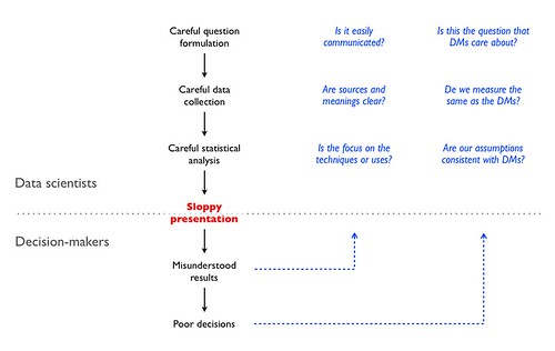
Some time ago, I summarized a broader view of a specific type of presentation event (data scientists presenting results to managers) in this diagram, illustrating why and how I thought data scientists should take more care with presentation design (click for larger):
(Note that this is specific advice for people making presentations based on data analysis to managers or decision-makers that rely on the data analysis for action, but cannot do the analysis themselves. Hence the blue rules on the right to minimize the miscommunication between the people from two different fields. This is what I mean by field-specific presentation training.)
These are four reasons why I don't like generic presentation training. Really it's just one: generic presentation training assumes that content is something secondary, and that assumption is the reason why we see so many bad presentations to begin with.
NOTE: Participant-centered learning is a general term for using the class time for discussion and exercises, not necessarily for the Harvard Case Method, which is one form of participant-centered learning.
During a decluttering of my place, I had to make decisions about which books to keep; these are some that I found useful for teaching and presentations, and I'm therefore keeping:
They are stacked by book size (for stability), but I'll group them in four major topics: general presentation planning and design; teaching; speechwriting; and visuals design.
1. Presentation planning and design
Edward Tufte's Beautiful Evidence is not just about making presentations, rather it's about analyzing, presenting, and consuming evidence.
Lani Arredondo's How to Present Like a Pro is the only "general presentation" book I'm keeping (and I'm still pondering that, as most of what it says is captured in my 3500-word post on preparing presentations). It's not especially good (or bad), it's just the best of the "general presentation" books I have, and there's no need for more than one. Whether I need one given Beautiful Evidence is an open question.
Donald Norman's Living With Complexity and Things That Make Us Smart are not about presentations, rather about designing cognitive artifacts (of which presentations and teaching exercises are examples) for handling complex and new units of knowledge.
Chip and Dan Heath's Made to Stick is a good book on memorability; inasmuch as we expect our students and audiences to take something away from a speech, class, or exec-ed, making memorable cognitive artifacts is an important skill to have.
Steve Krug's Don't Make Me Think is about making the process of interactions with cognitive artifacts as simple as possible (the book is mostly about the web, but the principles therein apply to presentation design as well).
Alan Cooper's The Inmates Are Running The Asylum is similar to Living With Complexity, with the added benefit of explicitly addressing the use of personas for designing complex products (a very useful product design tool for classes, I think).
I had other books on the general topic of presentations that I am donating/recycling. Most of them spend a lot of space discussing the management of stage fright, a problem with which I am not afflicted.
If I had to pick just one to keep, I'd choose Beautiful Evidence. (The others, except How To Present Like a Pro, are research-related, so I'd keep them anyway.)
Tools for teaching, by Barbara Gross Davis covers every element of course design, class design, class management, and evaluation. It is rather focussed on institutional learning (like university courses), but many of the issues, techniques, and checklists are applicable in other instruction environments.
Designing effective instruction, by Gary Morrison, Steven Ross, and Jerrold Kemp, complements Tools for teaching. While Tools for Teaching has the underlying model of a course, this book tackles the issues of training and instruction from a professional service point of view. (In short: TfT is geared towards university classes, DEI is geared towards firm-specific Exec-Ed.)
I had other books on the general topic of teaching (and a number of books on academic life) that I am donating/recycling.
3. Speechwriting and public speaking
Speak like Churchill, stand like Lincoln, by James Humes, should be mandatory reading for anyone who ever has to make a public speech. Of any kind. Humes is a speechwriter and public speaker by profession and his book gives out practical advice on both the writing and the delivery. I have read many books on public speaking and this one is in a class of its own.
I have a few books from the Toastmasters series; I'm keeping (for now at least) Writing Great Speeches and Choosing Powerful Words, though their content overlaps a lot with Virginia Tufte's Beautiful Sentences, a book I'm definitely keeping as part of my writing set.
I'm probably keeping Richard Dowis's The Lost Art of The Great Speech as a good reference for styles and as motivation reading. (Every so often one needs to be reminded of why one does these things.)
I have other books on writing, in general, but the ones in the pile above are specific to speechwriting. I'm throwing out a few books on the business of speechwriting; they are so bad that I thought of keeping them as satire. Donating them would be an act of cruelty towards the recipients.
If I had to pick just one book on speechwriting, I'd go with Speak like Churchill, Stand like Lincoln. Hands down the best in the category, and I've read many.
4. Visuals design
Yes, the design of visuals for presentations or teaching, not Visual Design the discipline.
Edward Tufte's books are the alpha and the omega in this category. Anyone with any interest in information design should read these books carefully and reread them often.
The Non-Designer Design Book, by Robin Williams lets us in on the secrets behind what works visually and what doesn't. It really makes one appreciate the importance of what appears at first to be over-fussy unimportant details. I complement this with The Non-Designer Type Book and Robin Williams Design Workshop, the first specifically for type, the second as an elaboration of the Non-Designer Design Book.
Perhaps I'm a bit focussed on typography (a common symptom of reading design books, I'm told), but Robert Bringhurst's The Elements of Typographic Style is a really good and deeply interesting book on the subject. Much more technical than The Non-Designer Type Book, obviously, and the reason why I hesitate to switch from Adobe CS to iWork for my handouts.
Zakia and Page's Photographic Composition: A visual guide is very useful as a guide to laying out materials for impact. Designing the visual flow of a slide (or a handout) -- when there are options, of course, this is not about "reshaping" statistical charts -- helps tell a story even without narration or animation.
I had some other books on the general topic of slide design, which I am donating. I also have a collection of books on art, photography, and design in general, which affords me a reference library. (That collection I'm keeping.)
If I had to pare down the set further, the last ones I'd give up are the four Tufte books. If forced to pick just one (in addition to Beautiful Evidence, which fills the presentation category above), I'd choose The Visual Display of Quantitative Information, because that's the most germane to the material I cover.
CODA: A smaller set
Not that I'm getting rid of the books in the larger set above (that's the set that I'm keeping), but I think there's a core set of books I should reread at least once a year. Unsurprisingly, those are the same books I'd pick if I really could have only one per category (or one set for the last category):
Note that the Norman, Heath Bros, Krug, Cooper books and my collection of art, photography, and design books are exempted from this choice, as they fall into separate categories: research-related or art. I also have several books on writing (some of them here).
And the books that didn't make the pile at the beginning of the post? Those, which I'm donating or recycling, make up a much larger pile (about 50% larger: 31 books on their way out).
The title bears repeating, as many people confuse instruction and presentation preparation skills and criteria for success: Preparing instruction is different from preparing presentations.
I made a diagram depicting my process of preparing for a instruction event (the diagram was for my personal use, but there's no reason not to share it; click for larger):
And, for comparison, the process for preparing presentations:
Because they look similar, I need to point out that the tools used in each phase of the process are different for presentations and for instruction.
I'm a big fan of participant-centered learning (though not necessarily the HBS cases that people always associate with PCL); the idea is simple: students learn from doing, not from watching the instructor do. So, many of the "materials" (more precisely, most of the time in the "plan with timing" part of the diagram) in an instruction event are audience work: discussions, examples brought by the audience (to complement those brought by the instructor) and exercises. These are not materials that can be used in a speech or a presentation to a large audience.
Also, while a story works as a motivator for both presentations and instruction, I tend to use exercises or problems as motivators for instruction. For example, I start a class on promotion metrics by asking "how do you measure the lift" of some promotional activity, and proceed from there. By making it a management task that they have to do as part of their jobs, I get some extra attention from the audience. Plus, they can immediately see how the class will help them with their jobs.*
There are presentations that are mostly for instruction purposes, and there are parts of instruction events that are presentations. But never mistake one for the other: preparing instruction is different from preparing presentations.
Though so much instruction is so poorly prepared that even the basics of presentation preparation will help make instruction less of a disaster, that's just a step towards instruction-specific preparation.
- - - - - - - - - - - -
*I have a large variety of exercises for each knowledge unit I teach, and they are not all of the form "here's a problem, what's the solution?" Some are of the forms "here's what a company is doing, what are they trying to achieve?" and "here's a problem, here's what the company is doing, what is wrong with that?"
Tools for teaching, by Barbara Gross Davis covers every element of course design, class design, class management, and evaluation. It is rather focussed on institutional learning (like university courses), but many of the issues, techniques, and checklists are applicable in other instruction environments.
Designing effective instruction, by Gary Morrison, Steven Ross, and Jerrold Kemp, complements Tools for teaching. While TfT has the underlying model of a class, this book tackles the issues of training and instruction from a professional service point of view. (In short: TfT is geared towards university classes, DEI is geared towards firm-specific Exec-Ed.)
As someone who makes presentations for a living,* I regularly peruse several blogs and forums on presentations. Here are three thoughts on presentation advice, inspired by that perusal.
1. The problem with much presentation advice is that it's a meta exercise: a presentation about presentations. And it falls into what I like to call the Norman Critique of Tufte's Table Argument (NCoTTA). From Don Norman's essay "In Defense Of Powerpoint":
Tufte doesn't overload the audience in his own talks—but that is because he doesn't present data as data, he presents data as examples of what slides and graphical displays might look like, so the fact that the audience might not have time to assimilate all the information is irrelevant.
It's funny that Tufte is actually one of the people who least deserve the NCoTTA; most presentation coaches make that error more often and to greater depths.
2. When an attendee of a short talk I recently gave asked me for quick advice on presentations I said: have a simple clear statement, in complete sentences, of what your presentation is supposed to achieve. He was flummoxed; I assume he wanted the secret sauce for my slides.
Here's a slide from that talk:
It's obvious that there is no secret sauce here; extending the cooking metaphor, what that slide shows is a good marinade: preparation. Though many presentation advice websites talk about rehearsal and working the room as preparation, what I mean is what this 3500-word post explains.
For example, knowing what the 100,000 SKU statistic is for, I chose to put the size of FMCG consideration sets as a footer, to contextualize the big number. Different uses of the big number get different footers to put it into the appropriate perspective. If all I wanted to do was illustrate how big that number is, I could say "if you bought a different SKU every day, you'd need almost 300 years to go through them all."
Most advice on presentations will not be useful because the content and the context of the presentation are much more important to the design of the presentation than generic rules. (Hence the NCoTTA problem so much advice has. Ditto for this slide, since I didn't explain what the talk was about.)
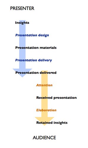
3. Speaking of Tufte, one of the things that separates him from the other presentation advocates is that he takes a full view of the communication process (partially illustrated in this post): from the speaker's data to the receiver's understanding. Here's a simple diagram to illustrate the sequence:
Most presentation advice is about the creation and, especially, the delivery of presentations. Tufte stands more or less alone as one who discusses the receiving and processing of presentation material: how to pay attention (not just being "engaged," but actually processing the information and checking for unstated assumptions, logical fallacies, psychological biases, or innumeracy) and how to elaborate on one's own, given presentation materials.
Other than Tufte and his constant reminder that receiving a presentation is an active process rather than a passive event, presentation coaches focus almost all their attention on the presenter-side processes. Many "Tufte followers" also miss this point: when processing a presentation by someone else they focus on the presentation itself (the slides, the design, the handouts) instead of the content of the presentation, i.e. the insights.
-- -- -- --
* Among other things, like teaching, creating original research, and writing.
Many presenters who are hard workers don't care for working on their presentations. That's odd.
Many researchers, data scientists, academics, and other knowledge discoverers are not very good at presenting their work. They argue, somewhat reasonably, that their strength is in formulating questions, collecting and processing data, and interpreting the results. Presentations are an afterthought.
The problem with this is the following:
If the purpose of finding out a true fact is to influence decision-makers, communicating that fact clearly is an essential step of the whole process. In fact, all the work done prior to the presentation will be wasted if the message doesn't get across.
Does it make sense to waste months of work discovering knowledge because one isn't in the mood to spend a few hourscrafting a presentation?
Slightly disjointed observations, inspired by a few presentations I've observed recently:
1. Obvious laziness is unprofessional. I saw a presentation to an audience that works with mathematics where the presenter used the "draw ellipse segment" tool to draw "exponentials" on a slide about exponential growth. Since exponentials look very different from quarter-ellipses, it was obvious that the presenter didn't think the presentation worth taking the one minute required to plot an actual exponential with a spreadsheet.
2. When in doubt, use less: colors, fonts, indent levels, bundled clipart; in fact, never use bundled clipart. Everyone has that same clipart, so the audience will be familiar with it, associating it with the other uses.
3. There is no correlation between the time it takes to make a slide and the time that slide should take in a presentation. I have several slides that took hours to make (just to make the slide, not to figure out the material going into it) that get shown for seconds in a presentation, because that's their job in that presentation. On the other hand I routinely keep one-word chyrons up for minutes, as chorus to what I'm saying.
4. If you're going to use quotations, make darn sure you get the reference right. Otherwise you'll sound like an idiot. Saying "Life is but a walking shadow" and attributing it to 'Q' in episode one of Star Trek The Next Generation is both ignorant of the quotation (Shakespeare, Macbeth, Act 5, Scene 5 – you can find that on the interwebs) and Star Trek TNG where John de Lancie (Q) clearly attributes it to Shakespeare. Also, complete sourcing (not just author) increases credibility by making the quotation easier to check.
5. Speaker notes are perfectly acceptable; just don't carry flash cards. Memorizing a speech is really hard and few people can do it correctly; if you're over 40 you can always make the joke that memory is the first thing to go (punch line: "I forgot where I heard that"). Your command of field knowledge can be demonstrated in the question-and-answer period; coincidentally, people who are good at memorizing speeches tend to do poorly in the Q&A... Just remember:
6. Speaker notes are for the speaker. Don't impose them on the audience. Most especially don't put them in outline form on your slides. It suggests that you don't know how to use "presenter screen" on your computer, or dead-tree-ware. Don Norman writes about that.
7. Preparation is essential. I already wrote 3500 words on this. Most presentations continue to fail due to obvious lack of preparation or of preparation time spent on the wrong end of the process (memorizing speech, rehearsing delivery; these are important finishing touches, but not where most preparation should focus).
And a bonus meta-observation, from Illka Kokkarinen: the biggest problem is still the incessant yammering for fifteen minutes to reach a conclusion that could have been written in one paragraph to be read in less than a minute. Good point! We are so used to our time being wasted that we no longer notice this.
[Added May 30, 2011.] A reader (who asked for anonymity) emails: Don't eat a beef and bean burrito in the two hours prior to the presentation. I'd go further and suggest carefully managing pre-presentation intake of liquids (a presenter with a full bladder becomes short-tempered and rushed) and foods with gastrointestinal disruption potential.
No, not "empower yourself" books and seminars. Of those I cannot speak. Presentation and teaching books and seminars, that's what I'm talking about. It all starts with this picture (click to enlarge):
I made that picture one evening, as entertainment. I was cleaning up my hard drive and started perusing old teaching materials; noticed the different styles therein; and decided to play around with InDesign. After a while I ended up putting online something that I believe has useful content. It includes some references, which is what I'm writing about here.
Though I'm writing about the references, I cannot overemphasize the importance of the seminars. Tufte's books explain all the material (and the seminar's potential value is realized only after studying the books); but the seminar provides a clear example that it works. Some may read the books and go back to outline-like bullet point disaster slides because they don't trust the approach to work with a live audience. Tufte's seminar allays these fears.
The HBS seminar is more specific to teaching, but for those of us in the knowledge diffusion profession it's full of essential information. There are books on the case method and participant-centered learning, but they are not comparable to the seminar. I know, because I read the books before. And when the seminar started I was skeptical. Very skeptical. And when the seminar ended I reflected on what had happened - the instructor had made us, the audience learn all the material I had read about, without stating anything about it. Reading a book about the classroom skill would be like reading a book about complicated gymnastics.
But, even if one cannot attend these seminars, here are some references that help:
Brain rules, by John Medina, uses neuroscience to give life advice. There are many things in it that apply to teaching and learning; in addition, the skill with which Medina explains the technical material and the underlying science to a popular audience, without dumbing it down, is a teaching/presentation tool to learn (by his example).
Things that make us smart, by Donald Norman, a book about cognitive artifacts, i.e. objects that amplify brain powers. I also recommend his essay responding to Tufte, essentially agreeing with his principles but disagreeing with his position on projected materials.
Speak like Churchill, stand like Lincoln, by James Humes, should be mandatory reading for anyone who ever has to make a public speech. Of any kind. Humes is a speechwriter and public speaker by profession and his book gives out practical advice on both the writing and the delivery. I have read many books on public speaking and this one is in a class of its own.
The non-designer design book, by Robin Williams lets us in on the secrets behind what works visually and what doesn't. It really makes one appreciate the importance of what appears at first to be over-fussy unimportant details.
Tools for teaching, by Barbara Gross Davis covers every element of course design, class design, class management, and evaluation. It is rather focussed on institutional learning (like university courses), but many of the issues, techniques, and checklists are applicable in other instruction environments.
These references helped me (a lot), but they are just the fundamentals. To go beyond them, I recommend:
Donald Norman's other books, as illustrations of how cognitive limitations of people interact with the complexity of all artifacts.
Robin Williams design workshop, which goes beyond the non-designers design book. E.g.: once you understand the difference between legibility (Helvetica) and readability (Times), you can now understand why one is appropriate for chorus slides (H) and the other for long written handouts (T).
On writing well, by William Zinsser. This book changed the way I write. It may seem orthogonal to presentations and teaching, but consider how much writing is involved in class preparation and creation of supplemental materials.
Designing effective instruction, by Gary Morrison, Steven Ross, and Jerrold Kemp, complements Tools for teaching. While TfT has the underlying model of a class, this book tackles the issues of training and instruction from a professional service point of view. (In short: TfT is geared towards university classes, DEI is geared towards firm-specific Exec-Ed.)
As usual, information in this post is provided only with the guarantee that it worked for me. It may - probably will - work for others. I still stand by the opener of my post on presentations:


 Binding energy per nucleon explains why heavy atoms can be fissioned and light atoms can be fused but not the opposite (because the move is towards higher binding energy per nucleon):