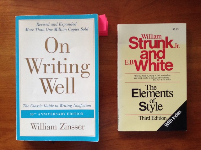
A quick read of mynotes on these two books always helps focus my attention for any writing task.
I make a point of re-reading Zinsser's book in its entirety at least once a year. It takes but a couple of hours, best 'writing skills preventative maintenance' I can think of. It's also worth re-reading my notes prior to any major writing task, which is why I'm doing it today. I think of it as 'pre-flighting my writing skills'.
Before any major writing task, I go over Strunk & White's rules so that they're fresh in my mind as I write. That helps cut down on editing time later.
It was the best of talks, it was the worst of talks.
(Yes, I understand that Dickens's opener has been used to the cliché limit; but the two examples I have in mind really bracket the space of possible talks. At least those talks with voluntary attendance.)
The best of talks: Michael Tilson Thomas at TED.
Even if you don't like art music, this talk is well worth watching for the presentation skills demonstrated by MTT:
MTT opens with a personal story of an interesting coincidence (his father's name was Ted); this is not my preferred type of opener, but he builds a personal narrative out of that opener and then merges it with his main topic very well.
MTT sits at a baby grand piano, which he occasionally plays to illustrate points about music evolution. This interactive production of the presentation material, similar to writing and running code or analyzing data in a technical presentation, has three main presentation advantages that make up for its risks:
1. Visual and physical variety, or more generally, presentation process variety. Every few seconds the image changes, the activity changes, the type of presentation changes: speaking, playing piano, describing a photo, narrating a video, watching a video without narration, listening to recorded music. Compare that with 18 minutes of speaking to slides bearing bullet points.
2. Clear demonstration of expertise, which projecting a video or playing recorded music cannot do. In a live demonstration or performance there's always a risk that something will go wrong, which is why many presenters avoid this kind of demonstration. But the willingness to take that risk is a strong signal to the audience of the presenter's competence and expertise.
3. Adaptability (not really used by MTT, since his was not a talk with audience interaction). This is particularly important in teaching technical material, I think: allowing the students to ask questions and see the answers come from the techniques that we're teaching them is a lot better than just showing them slides. (Of course real learning happens when the students do the work themselves, but this kind of demonstration helps begin the process and motivates them to act.)
The supporting materials were superbly chosen and executed. Credit here is due to a large supporting cast for MTT: this presentation uses materials and skills from the education and multi-media presence of the San Francisco Symphony, an organization whose main business is performing. But here are five important lessons that these materials illustrate:
1. No bullet points, and few words (mostly as subtitles for foreign language). The projected materials (including a large camera shot of MTT when no other materials are using the screen) are there to support what MTT is saying, not to remind MTT of what he wants to say.
2. The production values of the materials are professional (you can assess their quality on the 720p video) and that signals that this presentation is important to MTT, not something put together in the flight down, between checking email and imbibing airline liquor.
3. MTT's presentation never mentions the support, only the content: he doesn't say "this slide shows a photo of my father," he tells the story of discussing music with his father as the photo appears on screen. The photo is a support for the narrative instead of the narrative taking a detour to acknowledge the technology and the specifics of the material that is supporting it.
4. The interaction between materials, speech, and piano playing was choreographed in advance, with the video producer knowing which shots to use at each time. This comes from the extensive documentary and educational work of the San Francisco Symphony under MTT, but to some extent can be replicated by presenters of more technical material if they take the time to think of their presentation as a series of "cuts" in a video production.
5. It's not on the video, but it's obvious from the fluidity of the speaking, piano playing, and video materials that this talk was carefully planned and thoroughly rehearsed. That's not surprising: after all, a dress rehearsal is nothing new to a performing artist, and MTT clearly saw this talk as a performance. Most presenters would benefit from seeing their talks as performances (once they get the content part well taken care of, obviously).
The speech was well structured, with a strong opener and closer, repetition of the key points with different phrasing at the bridge points, and with the right mix of entertainment and education that is expected of a TED talk.
MTT had a teleprompter at his feet and notes on top of the piano, which in the video appear to include a couple of lines of music score, possibly as a reminder of the harmonic evolution he demonstrates at timecode 5:28 to 6:02. Many presenters are afraid that using speaker notes makes them look unprepared or "just reading their speech." This is an erroneous attitude for five reasons:
1. Expertise can be demonstrated in different ways, like MTT playing the piano. And as a general rule, the audience will have some idea of the expertise of the presenter, established ahead of time by other means.
2. Open discussion or question and answer periods allow the speaker to wow the audience with his or her ability to extemporize. (As a general rule, I suggest speakers prepare notes on some of the more likely questions that may need some thinking ahead, but not read them verbatim.)
3. Reading a speech is a difficult skill; most people can't do it correctly. Even when I write a speech for myself, I find that I also make notations on it and end up using it more as a psychological crutch than an actual speech to read. It's fairly obvious that MTT is not reading the speech verbatim.
4. Even if MTT is partially reading a prepared speech, it's most likely one that he had a big input in writing. Other than celebrities, politicians, and CEOs, most presenters will have written their speeches, and most audiences will expect that they did.
5. Ironically, many people who look down on unobtrusive speaker notes or teleprompters put their speaker notes on the screen as bullet points, confusing the materials that are there to help the speaker (notes) with the materials that are there to help the audience process the presentation (visual support).
The material MTT covers meshes with music history so he uses stories and storytelling as the main text form. Stories are one of the six tools for memorability the Heath brothers recommend in the book Made To Stick, and they work very well here. MTT also uses what Edward Tufte calls the P-G-P approach to exposition, presenting a Particular case first, then making a General point, then capstoning that point with another Particular example.
Dancing and singing aren't common techniques in presentations, but MTT uses them to great effect at timecode 2:24. In other presentations some acting or character impressions can be used for the same purpose: break the solemnity of the occasion, signal that you take the subject seriously but you don't take yourself too seriously, or to bridge topics.
(On a video that's no longer available online, John Cleese of Monty Python keeps interrupting his own presentation on creativity techniques with "How many X does it take to change a light bulb" jokes, as a way to give the audience breaks. And those jokes are part of a running arc that he established at the beginning of "there's no real training for creativity so I might as well spend my time telling jokes.")
Personally I don't recommend singing, dancing, or telling jokes in a talk unless you are a professional singer, dancer, or comedian, and even so only sparingly. Note that MTT did it for a very specific and memorable point: that a "piece of 18th Century Austrian aristocratic entertainment" turned into the "victory crow of [a] New York kid," and that's the atemporal power of music.
And as a closer, MTT rehashes the opening theme "what and how" and adds a cornerstone "why," ending on a good note and high energy. It's always important to have a strong closer, almost as important as a good opener.
Two minor observations:
1. MTT should have had a sip of water right before the talk and sloshed it around his mouth and lips, to avoid that smacking sound when he speaks. That sound is created by dryish areas in the mouth letting go at inappropriate times; sloshing the water solves it, drinking doesn't.
2. I assume that MTT's fleece was chosen to match his clothes and accessories, but he could have one custom-made in that color with the logo of the San Francisco Symphony. Maybe this is my crass commercialism rearing its ugly head, but with not flaunt the brand?
The worst of talks: a presenter who will remain anonymous at an undisclosed conference.
For clarity of exposition I'll call the presenter EF, for "Epic Fail," and use the pronoun "he" without loss of generality over gender.
EF started his presentation with a classic: computer trouble.
EF's talk was the last in a four-talk session; the other three presenters had installed their presentations in the podium computer during the break before the session, but EF did not. An alternative to using the podium computer would be to connect his laptop and test the setup during the pre-session break. A third possibility would be to connect his computer while the previous presenter was taking questions from the audience; personally I find this disruptive and avoid it, but it's better than what happened.
And what happened was that after four minutes of failed attempts to connect his computer to the podium (out of a total time per speaker of twenty minutes, including the Q&A period), EF asked the audience for a flash drive so he could transfer his presentation to the podium computer.
Presentation starts after six minutes of unnecessary computer-related entropy.
The room where this happened was an executive education classroom, with U-shaped seating, two projection screens side-by-side at the front and large flat screen TVs on the side walls so that the people on the straight part of the U could look at them instead of the front screens. These TVs also serve as a way for the presenter to see what's on screen while looking towards the audience.
Which is why everyone was puzzled when EF walked to one side of the front screens, turned his back to the audience and started talking in a monotone, while -- apparently -- clicking the remote at random. Really: he moved his slides up and down apparently at random and at high speed, maybe one-second on screen per slide, and without any connection to what he was saying.
But that's fine, because what he was saying was also disconnected within itself. In fact, I don't think he had any idea -- let alone a clear idea -- of what he wanted the audience to take away from the talk.
As far as I could gather, from reading the abstract about four times until I made some sense of it by writing a modal logic model of the essential words therein and crossing the 90% of words that were filler: there's a well-established phenomenon that is observable in a series of measures $X(p)$ as we vary the parameter $p$. The presentation was about changing the parameter space from $P_1$ to $P_2$, with $P_1 \subset P_2$. All tests in the literature concern themselves with the effects measured in $P_1$, and this paper tests the effects in $P_2$. This was not clear in the abstract or the presentation.
One of the slides that was on-screen several times, for about 4 seconds at a time, showed a table with the results from the literature, that is $X(p), p\in P_1$. Every time EF wanted to say something about these results, he moved several slides up and down, looking for the bullet point he wanted -- a point about the table that he had therefore removed from the screen. But that's not the worst.
After spending ten minutes explaining to an audience of experts in the subject matter a well-known point in the field of their expertise, EF glossed over details of his measurement technique, experimental procedure, and data processing, and presented his table of $X(p), p\in P_2$.
Without the $X(p), p\in P_1$ values for comparison.
Let me repeat that: he presented his results, which are to be compared and contrasted to the established results, on a separate table. Now, the phenomenon is well-established, but this is a table of numbers with three or four significant digits, so the details aren't that easy to recall. They are even harder to recall when EF keeps changing slides to look for bullet points about this table, again removing the table from the screen. Let me also point out that these are about 12 rows of 2 numbers per row, 4 with the comparison, well within the capacity of a one-slide table.
Every so often EF would stop abruptly in the middle of a sentence and silently move his slides up and down looking for something, then start a whole new sentence, without stopping the up-and-down movement of the slides.
But the clincher, the payoff after this painful exercise?
EF had no conclusions. His team was still analyzing the data, but so far it appeared that there was no change at all from the well-established phenomenon.
Now, in many fields, showing that a well-established phenomenon applies beyond the boundaries of the previous experiments is a valuable contribution. But in this case the expansion from $P_1$ to $P_2$ was trivial at best.
At this point, and about four minutes over time, EF invited the audience to ask questions. There were no takers, so EF asked one of the audience members (presumably an acquaintance) what he thought of some minor detail that EF had actually not talked about. The audience member said something noncommittal, and EF pressed the point, trying to get a discussion going. The rest of the audience was packed and ready to leave, but EF paid them as much attention during this failed attempt at a dialog as he had during his failed attempt at a presentation.
I was told later by another attendee that this presentation was not atypical for EF.
MTT is a performing artist, a showman by profession. The presentation he delivered was designed by a support team of graphic artists, cinematographers, writers: it fits within the education efforts of the San Francisco Symphony. MTT's audience is mostly there for entertainment and positively predisposed towards the celebrity presenter. His material is naturally multi-media, interactive, and pleasant, requiring very little effort on the audience part to process it. And, let's not forget, the presentation event itself was a team effort -- MTT is not operating the video screen or the teleprompter at his feet.
EF is a researcher and a professor. His presentation was designed by him, an untrained presenter (obvious from the talk), and delivered to an academic audience: hard to impress, critical, and possibly even hostile. His material is technical, dry, and requires significant effort (even in the best circumstances) to process and follow. He didn't have a teleprompter (though he could have speaker notes had he chosen to) nor a presentation support team.
So, yes, it seems that I'm being unfair in my comparison.
Except that there were, in that very same conference, three keynote speakers with equally dry, non-multimedia, hard to process material, who did a great job. They varied a lot in style and delivery but all made their points clear and memorable, kept their presentations moving along, and didn't use their projected materials as a crutch.
Above all, they had something interesting and important to say, they knew precisely what it was, and they made sure the audience understood it.
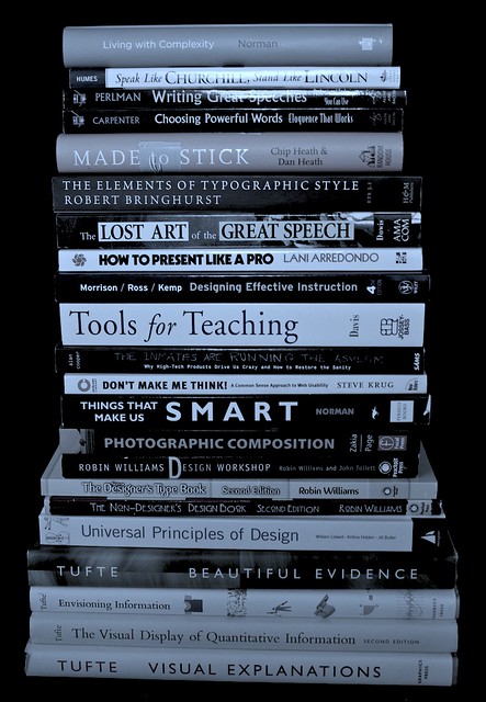
During a decluttering of my place, I had to make decisions about which books to keep; these are some that I found useful for teaching and presentations, and I'm therefore keeping:
They are stacked by book size (for stability), but I'll group them in four major topics: general presentation planning and design; teaching; speechwriting; and visuals design.
1. Presentation planning and design
Edward Tufte's Beautiful Evidence is not just about making presentations, rather it's about analyzing, presenting, and consuming evidence.
Lani Arredondo's How to Present Like a Pro is the only "general presentation" book I'm keeping (and I'm still pondering that, as most of what it says is captured in my 3500-word post on preparing presentations). It's not especially good (or bad), it's just the best of the "general presentation" books I have, and there's no need for more than one. Whether I need one given Beautiful Evidence is an open question.
Donald Norman's Living With Complexity and Things That Make Us Smart are not about presentations, rather about designing cognitive artifacts (of which presentations and teaching exercises are examples) for handling complex and new units of knowledge.
Chip and Dan Heath's Made to Stick is a good book on memorability; inasmuch as we expect our students and audiences to take something away from a speech, class, or exec-ed, making memorable cognitive artifacts is an important skill to have.
Steve Krug's Don't Make Me Think is about making the process of interactions with cognitive artifacts as simple as possible (the book is mostly about the web, but the principles therein apply to presentation design as well).
Alan Cooper's The Inmates Are Running The Asylum is similar to Living With Complexity, with the added benefit of explicitly addressing the use of personas for designing complex products (a very useful product design tool for classes, I think).
I had other books on the general topic of presentations that I am donating/recycling. Most of them spend a lot of space discussing the management of stage fright, a problem with which I am not afflicted.
If I had to pick just one to keep, I'd choose Beautiful Evidence. (The others, except How To Present Like a Pro, are research-related, so I'd keep them anyway.)
Tools for teaching, by Barbara Gross Davis covers every element of course design, class design, class management, and evaluation. It is rather focussed on institutional learning (like university courses), but many of the issues, techniques, and checklists are applicable in other instruction environments.
Designing effective instruction, by Gary Morrison, Steven Ross, and Jerrold Kemp, complements Tools for teaching. While Tools for Teaching has the underlying model of a course, this book tackles the issues of training and instruction from a professional service point of view. (In short: TfT is geared towards university classes, DEI is geared towards firm-specific Exec-Ed.)
I had other books on the general topic of teaching (and a number of books on academic life) that I am donating/recycling.
3. Speechwriting and public speaking
Speak like Churchill, stand like Lincoln, by James Humes, should be mandatory reading for anyone who ever has to make a public speech. Of any kind. Humes is a speechwriter and public speaker by profession and his book gives out practical advice on both the writing and the delivery. I have read many books on public speaking and this one is in a class of its own.
I have a few books from the Toastmasters series; I'm keeping (for now at least) Writing Great Speeches and Choosing Powerful Words, though their content overlaps a lot with Virginia Tufte's Beautiful Sentences, a book I'm definitely keeping as part of my writing set.
I'm probably keeping Richard Dowis's The Lost Art of The Great Speech as a good reference for styles and as motivation reading. (Every so often one needs to be reminded of why one does these things.)
I have other books on writing, in general, but the ones in the pile above are specific to speechwriting. I'm throwing out a few books on the business of speechwriting; they are so bad that I thought of keeping them as satire. Donating them would be an act of cruelty towards the recipients.
If I had to pick just one book on speechwriting, I'd go with Speak like Churchill, Stand like Lincoln. Hands down the best in the category, and I've read many.
4. Visuals design
Yes, the design of visuals for presentations or teaching, not Visual Design the discipline.
Edward Tufte's books are the alpha and the omega in this category. Anyone with any interest in information design should read these books carefully and reread them often.
The Non-Designer Design Book, by Robin Williams lets us in on the secrets behind what works visually and what doesn't. It really makes one appreciate the importance of what appears at first to be over-fussy unimportant details. I complement this with The Non-Designer Type Book and Robin Williams Design Workshop, the first specifically for type, the second as an elaboration of the Non-Designer Design Book.
Perhaps I'm a bit focussed on typography (a common symptom of reading design books, I'm told), but Robert Bringhurst's The Elements of Typographic Style is a really good and deeply interesting book on the subject. Much more technical than The Non-Designer Type Book, obviously, and the reason why I hesitate to switch from Adobe CS to iWork for my handouts.
Zakia and Page's Photographic Composition: A visual guide is very useful as a guide to laying out materials for impact. Designing the visual flow of a slide (or a handout) -- when there are options, of course, this is not about "reshaping" statistical charts -- helps tell a story even without narration or animation.
I had some other books on the general topic of slide design, which I am donating. I also have a collection of books on art, photography, and design in general, which affords me a reference library. (That collection I'm keeping.)
If I had to pare down the set further, the last ones I'd give up are the four Tufte books. If forced to pick just one (in addition to Beautiful Evidence, which fills the presentation category above), I'd choose The Visual Display of Quantitative Information, because that's the most germane to the material I cover.
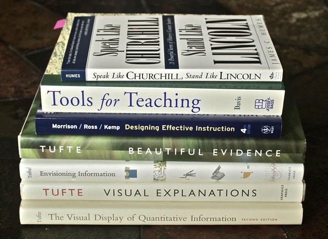
CODA: A smaller set
Not that I'm getting rid of the books in the larger set above (that's the set that I'm keeping), but I think there's a core set of books I should reread at least once a year. Unsurprisingly, those are the same books I'd pick if I really could have only one per category (or one set for the last category):
Note that the Norman, Heath Bros, Krug, Cooper books and my collection of art, photography, and design books are exempted from this choice, as they fall into separate categories: research-related or art. I also have several books on writing (some of them here).
And the books that didn't make the pile at the beginning of the post? Those, which I'm donating or recycling, make up a much larger pile (about 50% larger: 31 books on their way out).